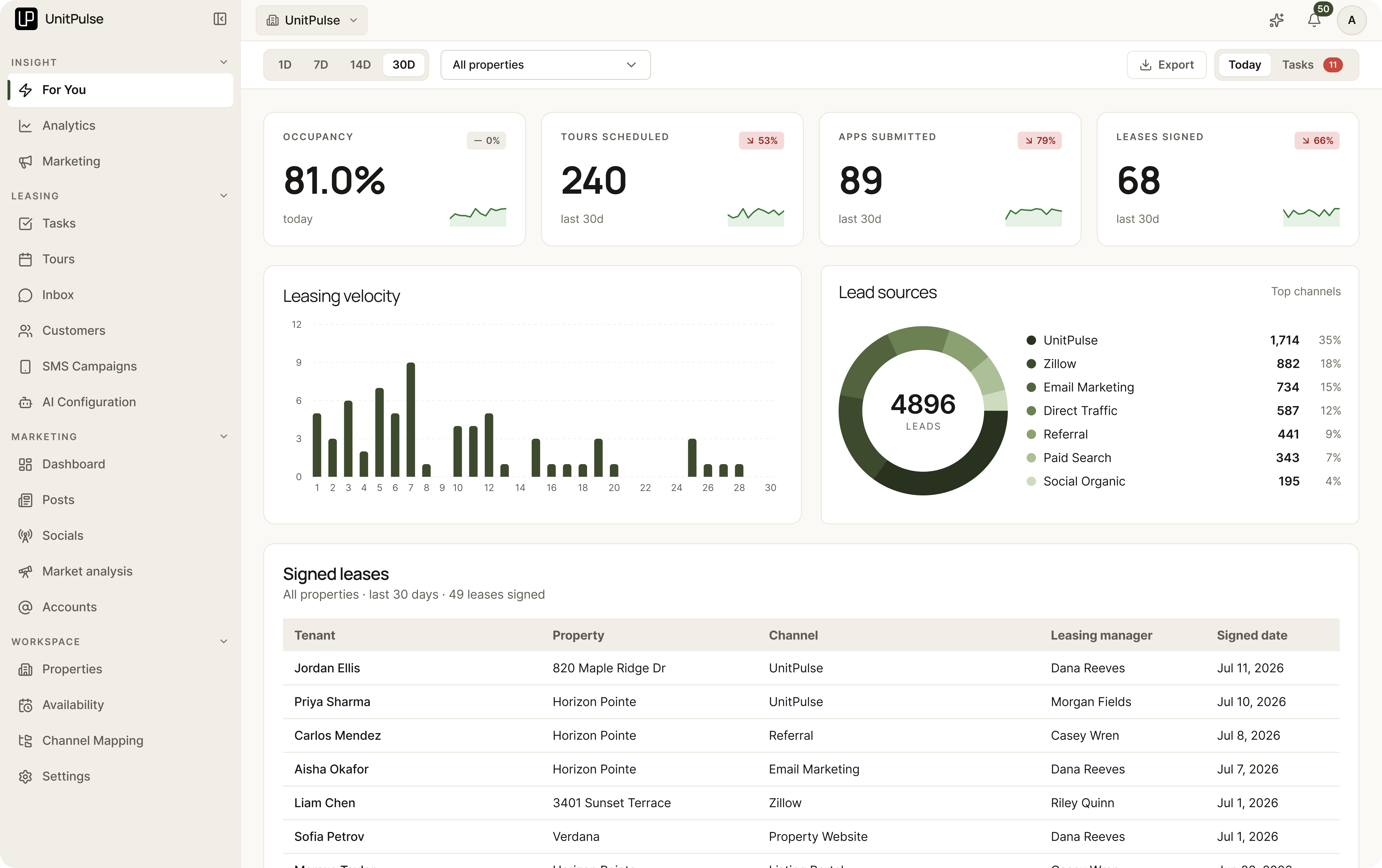
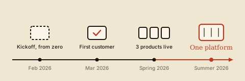
An AI-native leasing platform for property owners and their teams. It finds renters, converts them, and measures the funnel. We built it from zero starting February 2026, and the first paying customer signed a month later.
UnitPulse · 2026 · Product Design Lead
UnitPulse Platform
An AI-native leasing platform that finds renters, converts them, and measures the funnel. Built from zero in 2026.
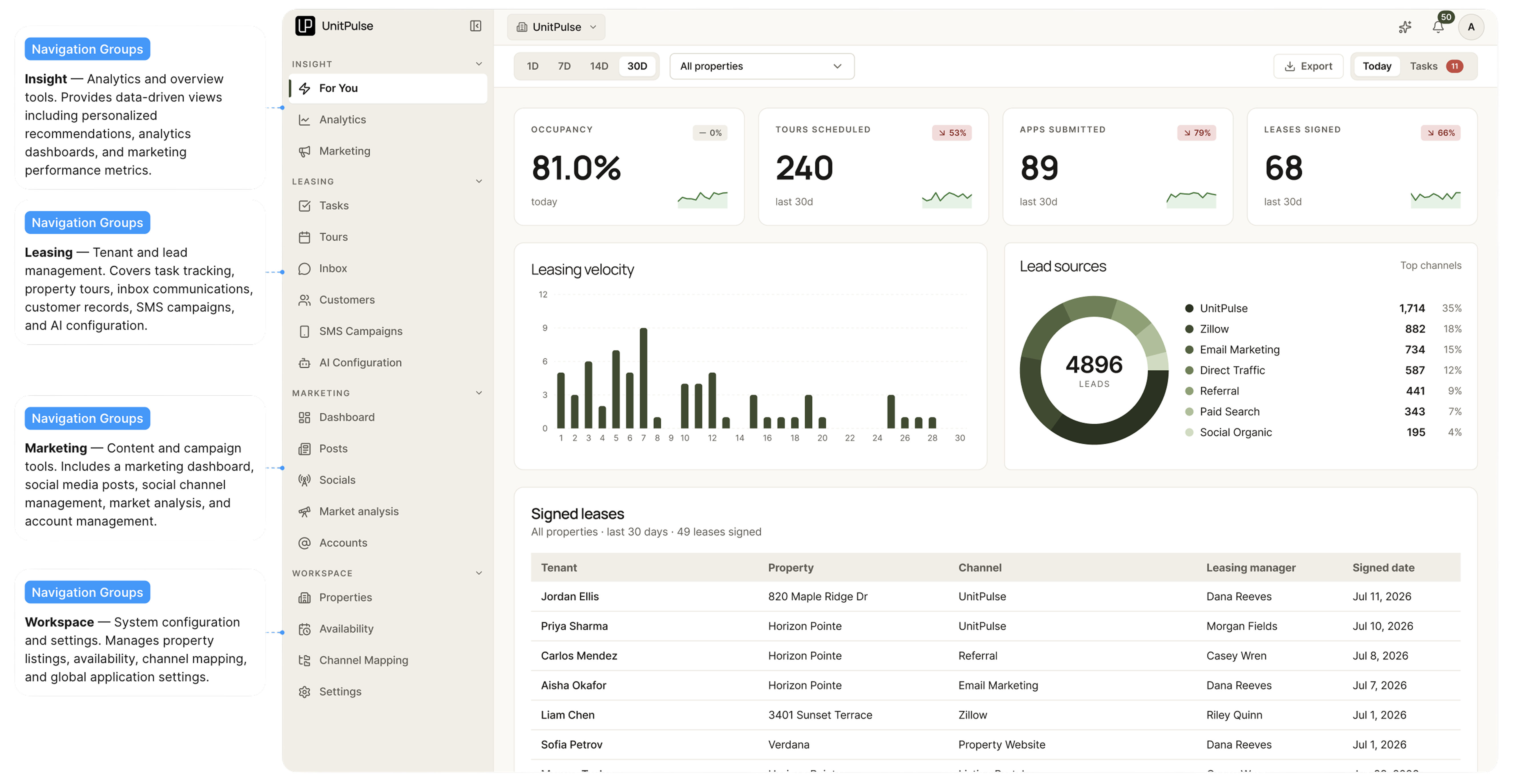
What UnitPulse is
-
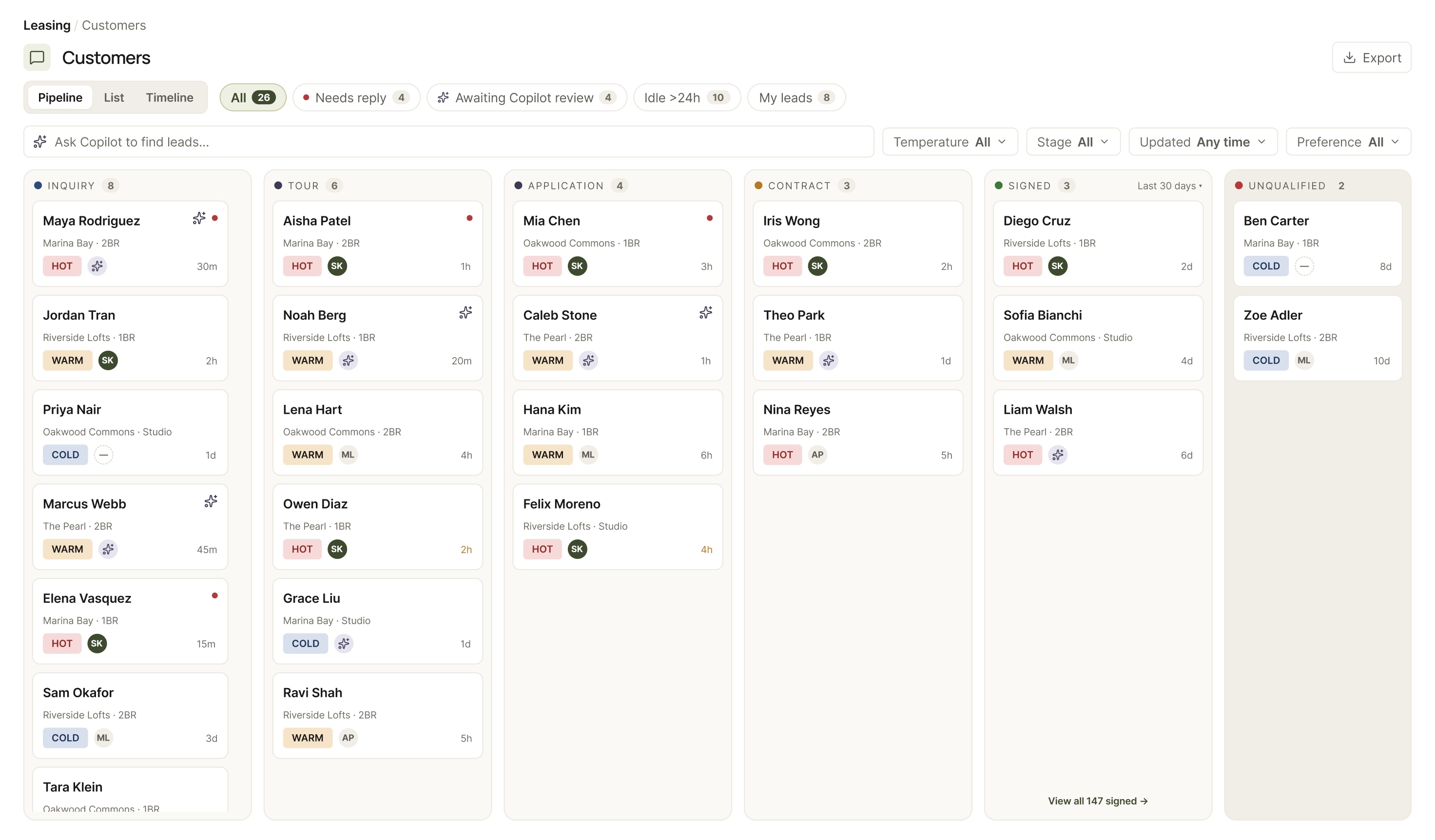
Every lead, inquiry to signed
-
Just ask Copilot
-
Posts on market data
-
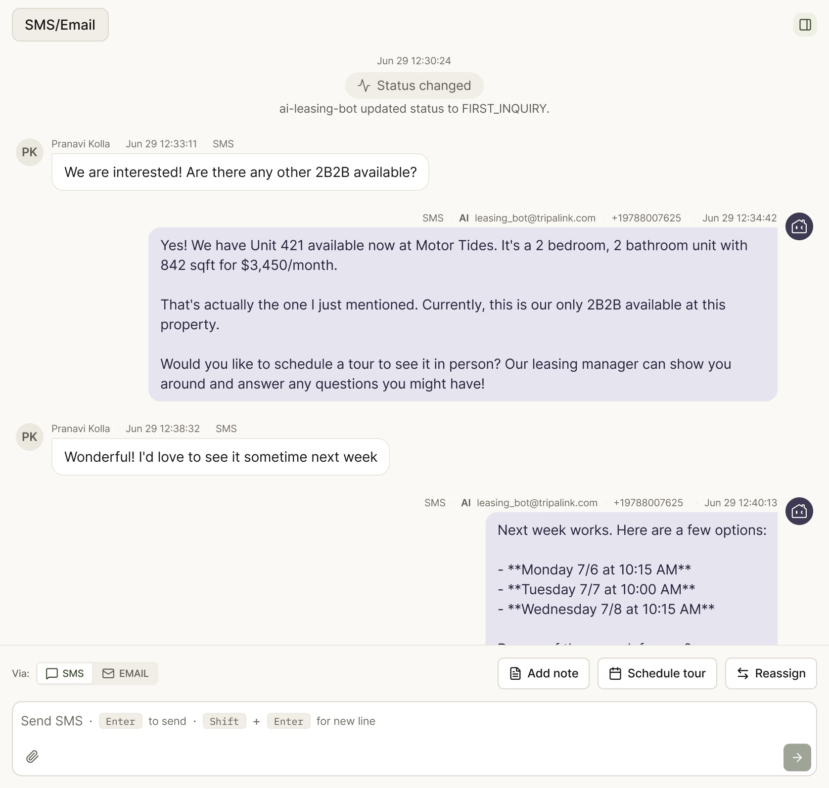
AI leasing
-
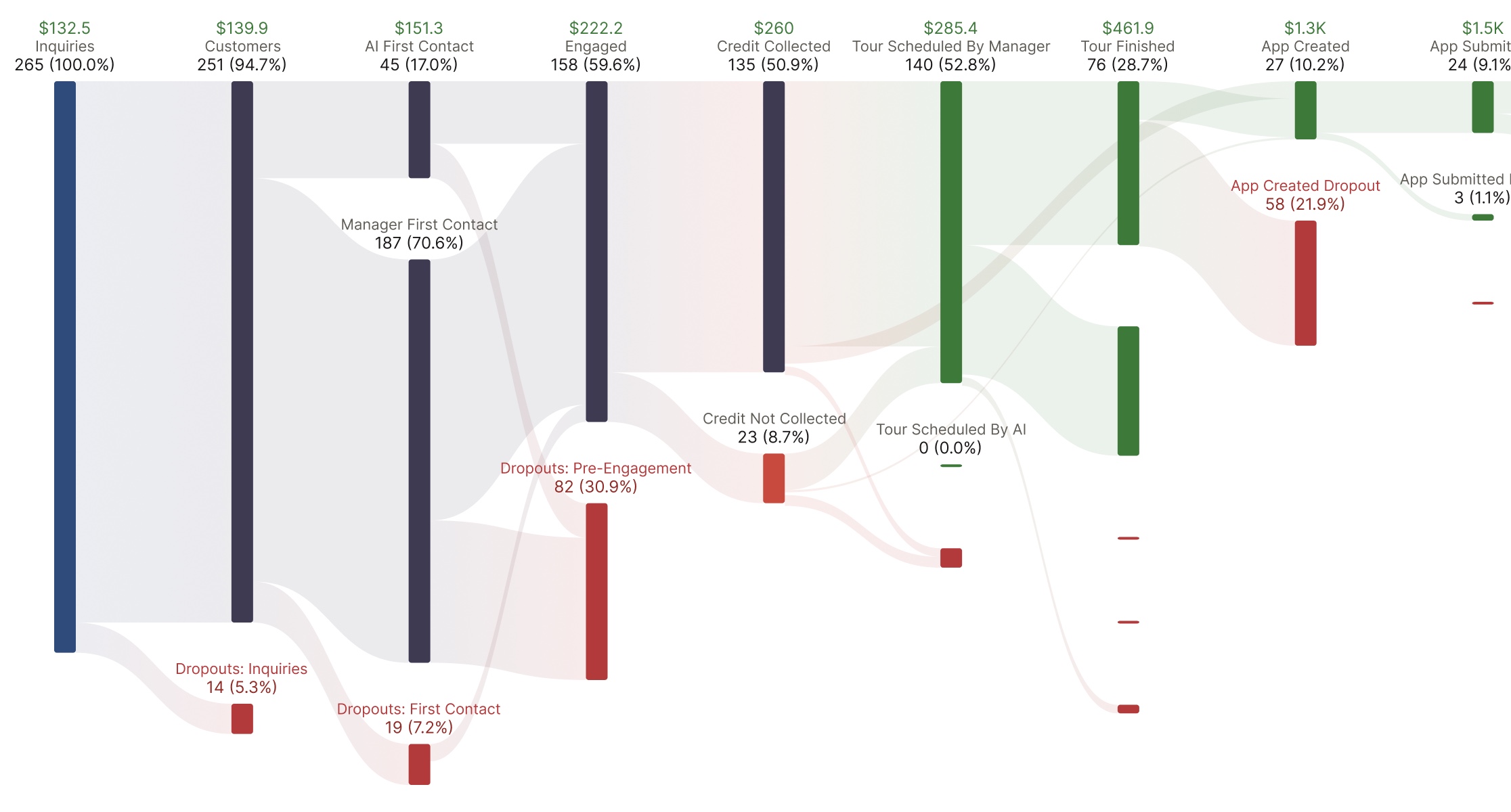
Look into drop-offs
Who it serves
Leasing still runs on spreadsheets, 7 disconnected tools, and messages nobody answered. The platform is built around 3 people.
3 people, 3 pains
-

The independent landlord
Owns a handful of units; leasing eats evenings and weekends.
- Spreadsheet reporting
- No analyst
- Every lead counts
NeedsAnswers at a glance, and an AI that follows up overnight.
-

The property manager
Runs a portfolio across neighborhoods with a small leasing team.
- 7 tools
- Team coordination
- Owner reporting
NeedsOne system of record for marketing, agents, and the funnel.
-

The leasing agent
Between tours all day, while the CRM lives on a desktop.
- Menu-deep CRM
- Follow-ups pile up
- Always mobile
NeedsOne sentence instead of 15 clicks, with the office in their pocket.
Marketing: generate demand
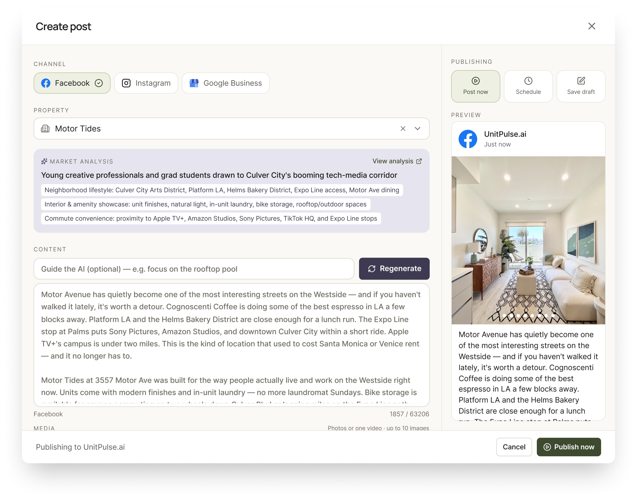
UP Marketing drafts posts and property content for each channel and each renter segment, and it keeps the Google Business Profile current, because “apartments near me” still lands there first.
Leasing: convert leads
UP Leasing turns that demand into signed leases. The AI answers every inquiry knowing who’s asking, writes follow-ups worth reading, and books the tour.
The segment playbook
-
Virtual-first for renters abroad
An international student can't tour in person, so the AI leads with a virtual tour and flexible scheduling.
-
The amenity-gap playbook
“No gym?” doesn't end the conversation. The AI points to the closest one, or leads with what the property does have.
-
Emails that engage
Follow-ups written to the renter's actual interests, not blasted to a list.
Same question, different renter, different answer.
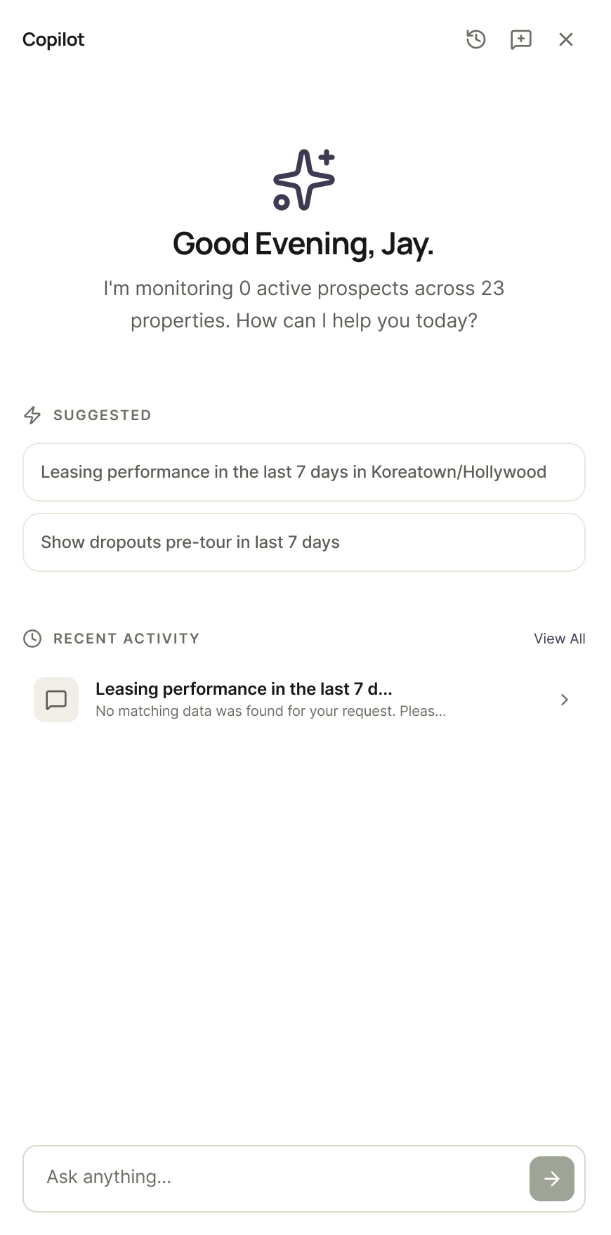
Agents drive all of it by typing. I first proved the Copilot pattern on a 2025 predecessor CRM, where it replaced a 15-click path with one sentence; here it fronts the platform’s whole AI suite.
Insight: optimize operations
UP Insight closes the loop for owners who aren’t analysts: the full funnel, per-prospect attribution, AI alerts, and a plain-language Data Copilot. Attribution shows which segments and channels actually sign leases, which then steers what Marketing writes next.
79
Accounts adopted it
78 active usersPendo · May 2026
52
On the core dashboard
≈66% of all accountsfunnel · attribution · Data Copilot
~45 min
Per user, per week
high engagement for B2B analytics
3 products to one platform
Customers came for Marketing, then asked us to run the whole journey. But 3 products meant 3 logins, drifting UI, and no shared front door for the AI. So we merged them behind one login and one design system, with the Copilot as the shared command layer. It was a phased merge, not a rewrite.
What made the merge safe
-
One design language
Canonical primitives replaced each app's local variants, so the merged UI stopped drifting.
-
Rules that keep it coherent
An anti-pattern rulebook that kills recurring UI bugs instead of re-fixing them.
-
A merge, not a rewrite
Namespaced routes and a phased cutover. The legacy apps kept shipping, so customers never hit a cliff.
I led the UX layer and the design-system primitives; the absorption architecture was a shared effort with engineering. It’s built and merged today, but not yet cut over.
The design system
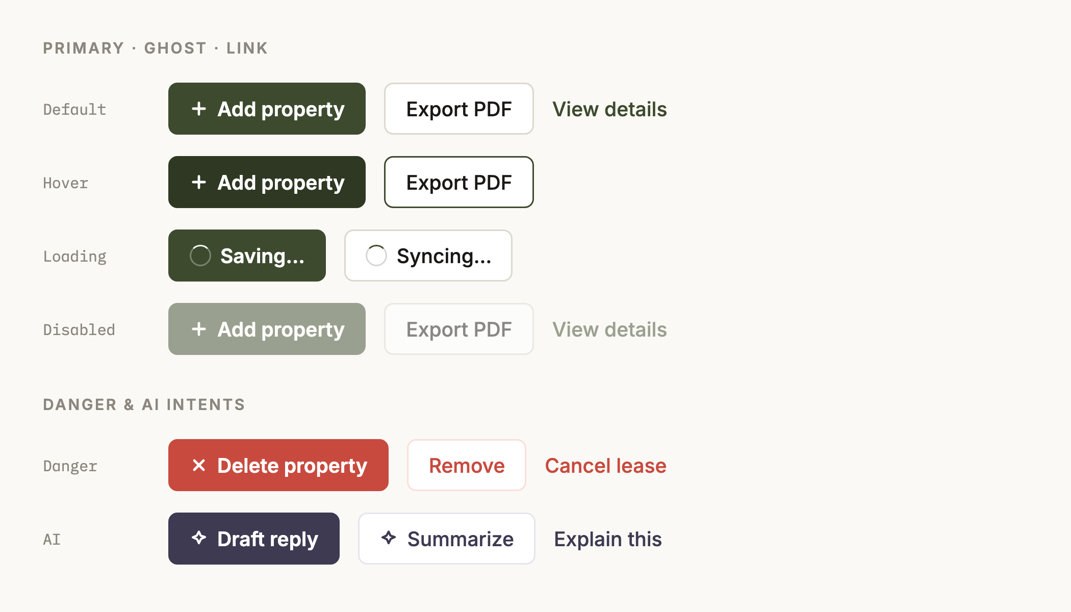
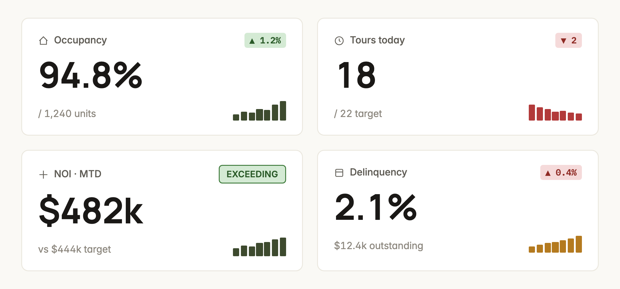
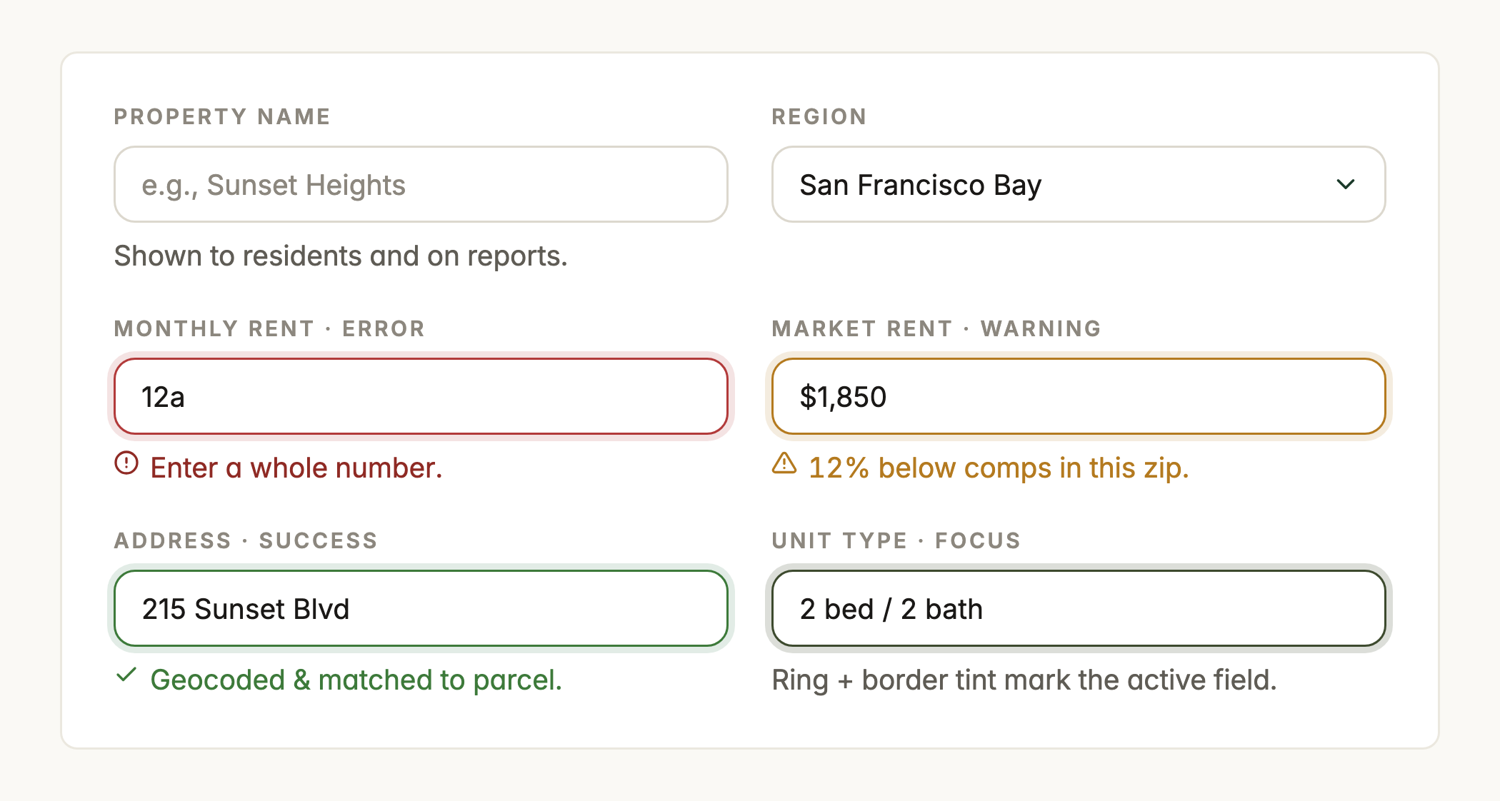
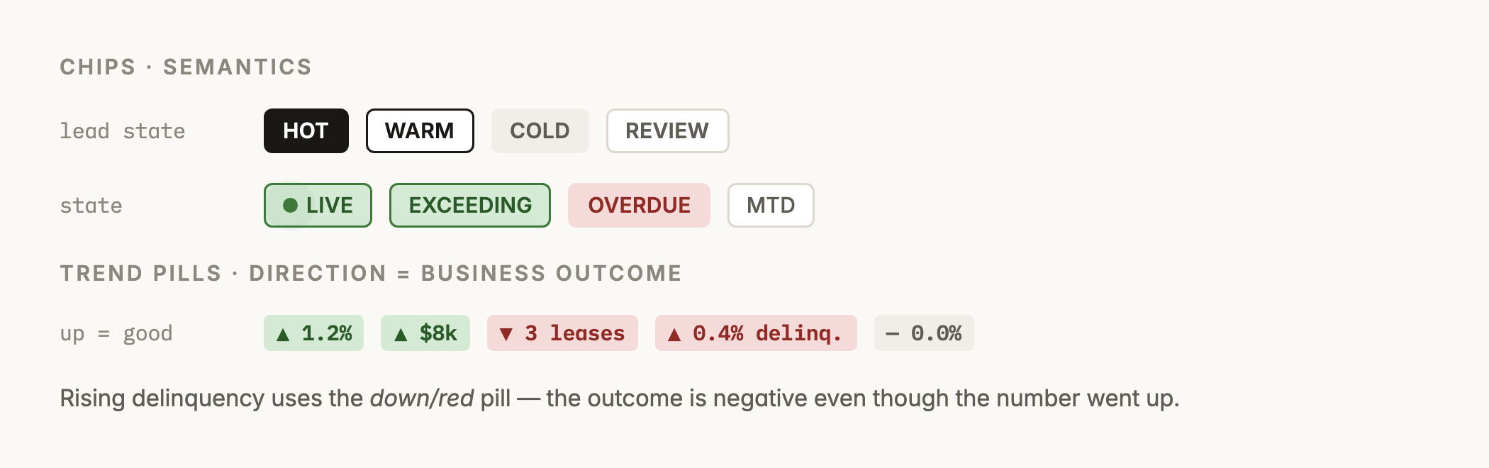
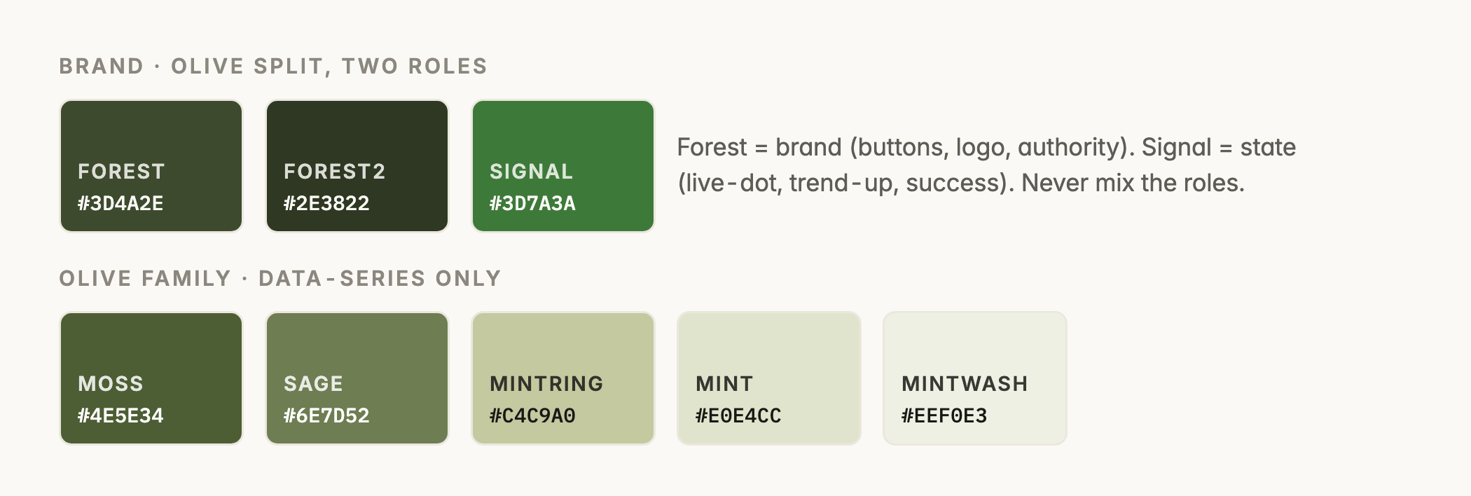
“One design language” is a claim, so here is the language itself. Warm cream surfaces, 2 greens with strict roles (olive for the brand, signal green for state — they never trade places), tabular numbers everywhere, 3 shadows in the entire system, dark mode built in. It lives as tokens and component CSS that the products build against, so the UI can’t drift apart again.
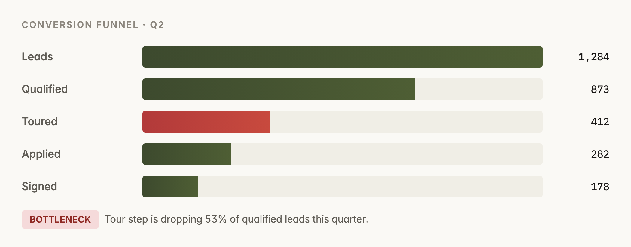
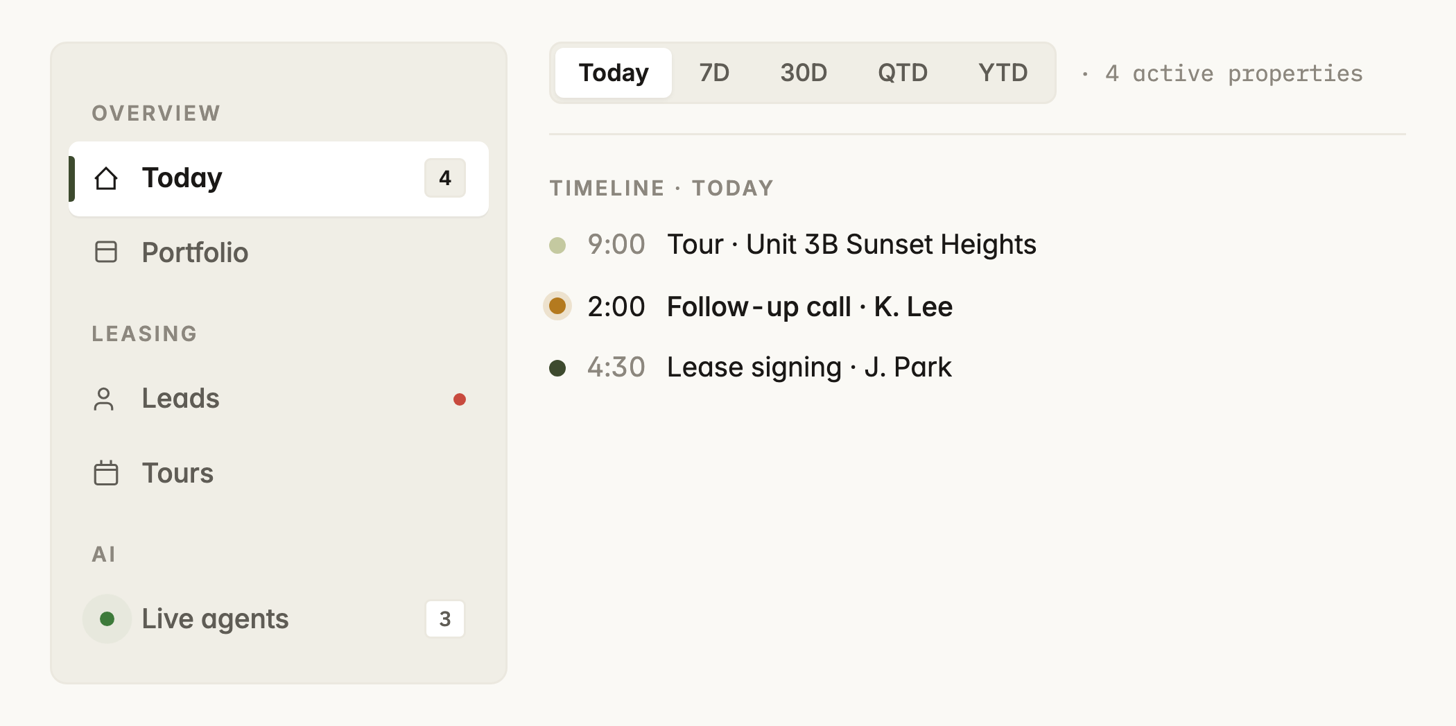
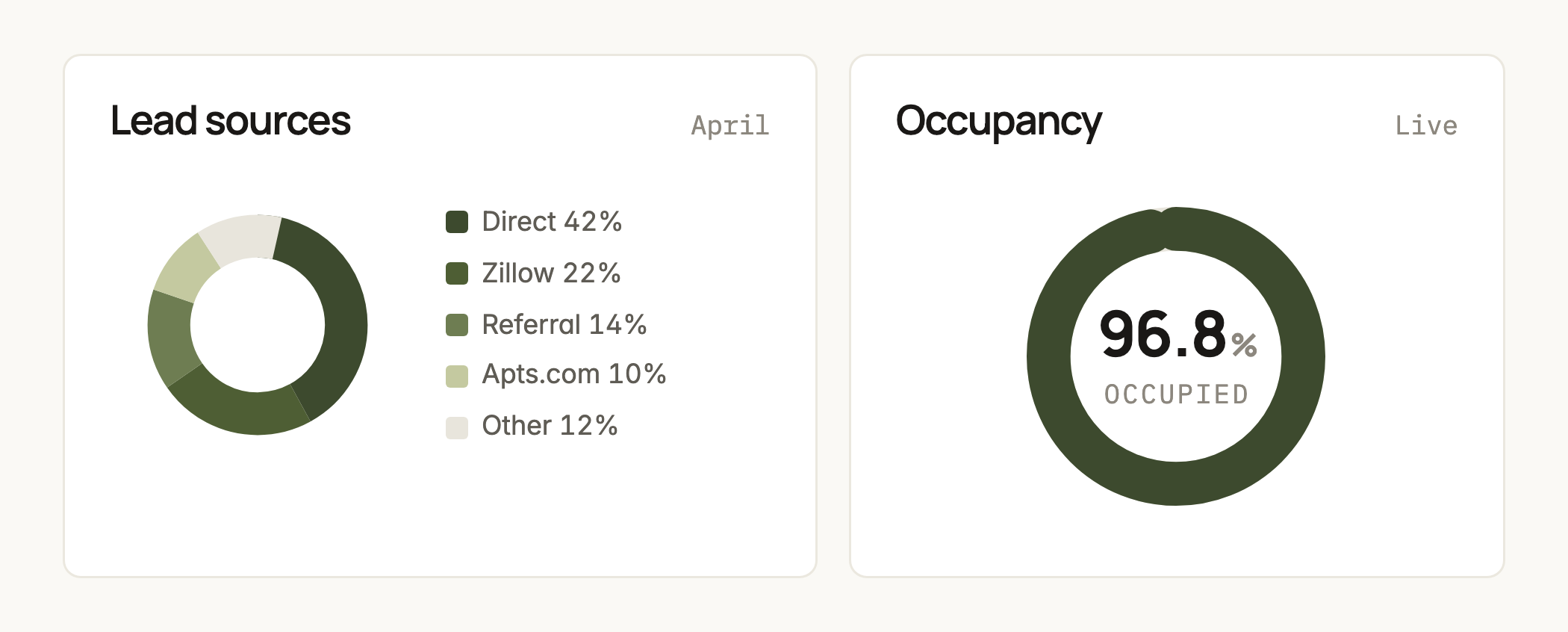
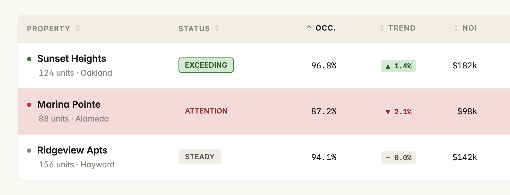
The rules that keep it tight
-
2 greens, 2 roles
Olive is the brand: buttons, logo, authority. Signal green is state: trend-up, live, success. They never trade places.
-
Selected is ink, not green
Active nav and segmented controls use ink. Green would read as branded when the element is just selected.
-
3 shadows, total
One for cards, one for the phone frame, one for modals. Everything else sits flat on a hairline border.
Foundations, light and dark
Dark mode is a token swap, not a second theme to maintain: the same component CSS reads flipped surface and state values.
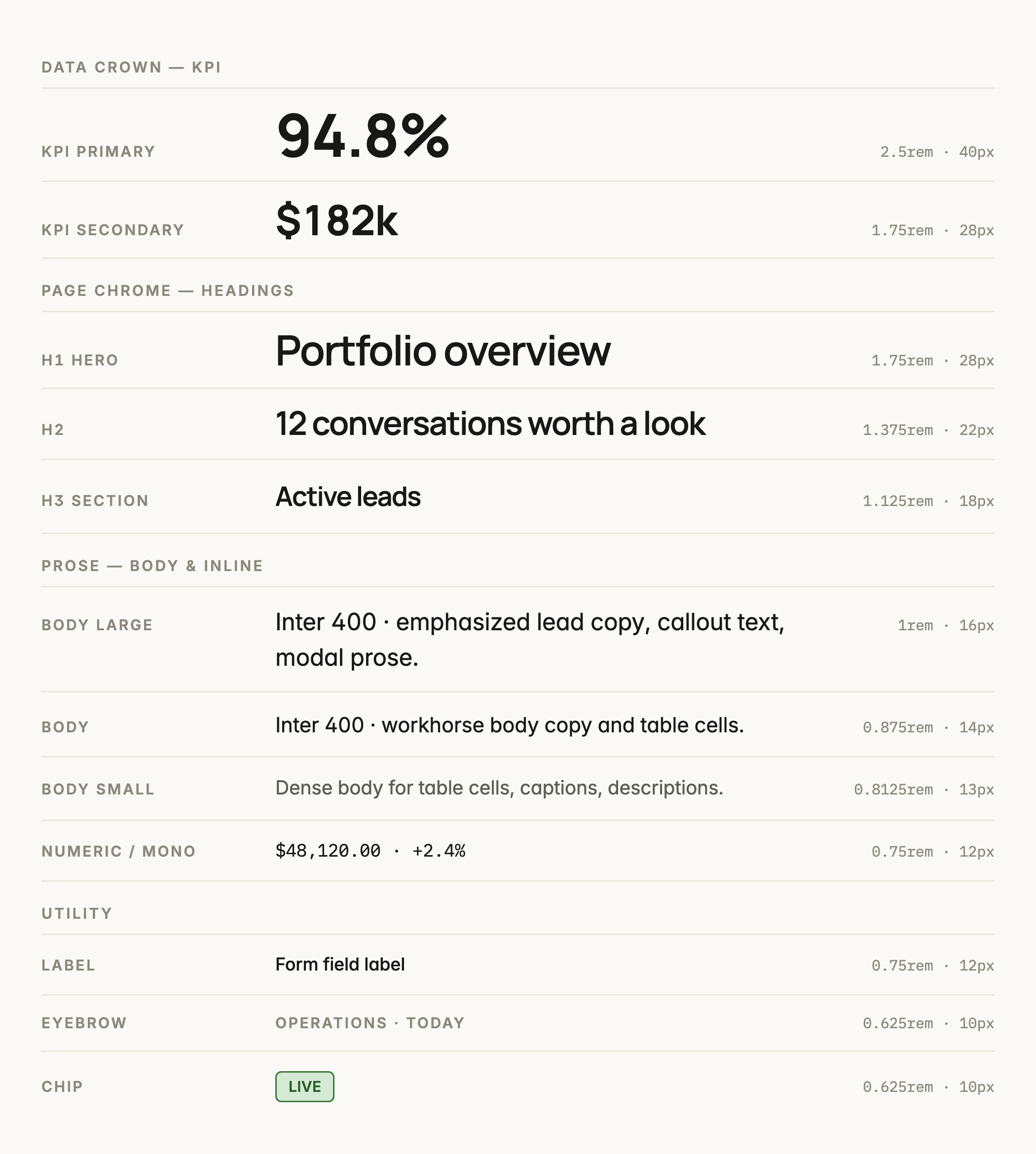
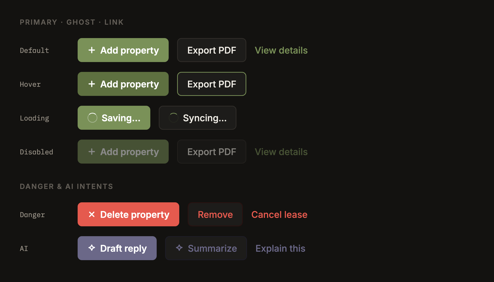
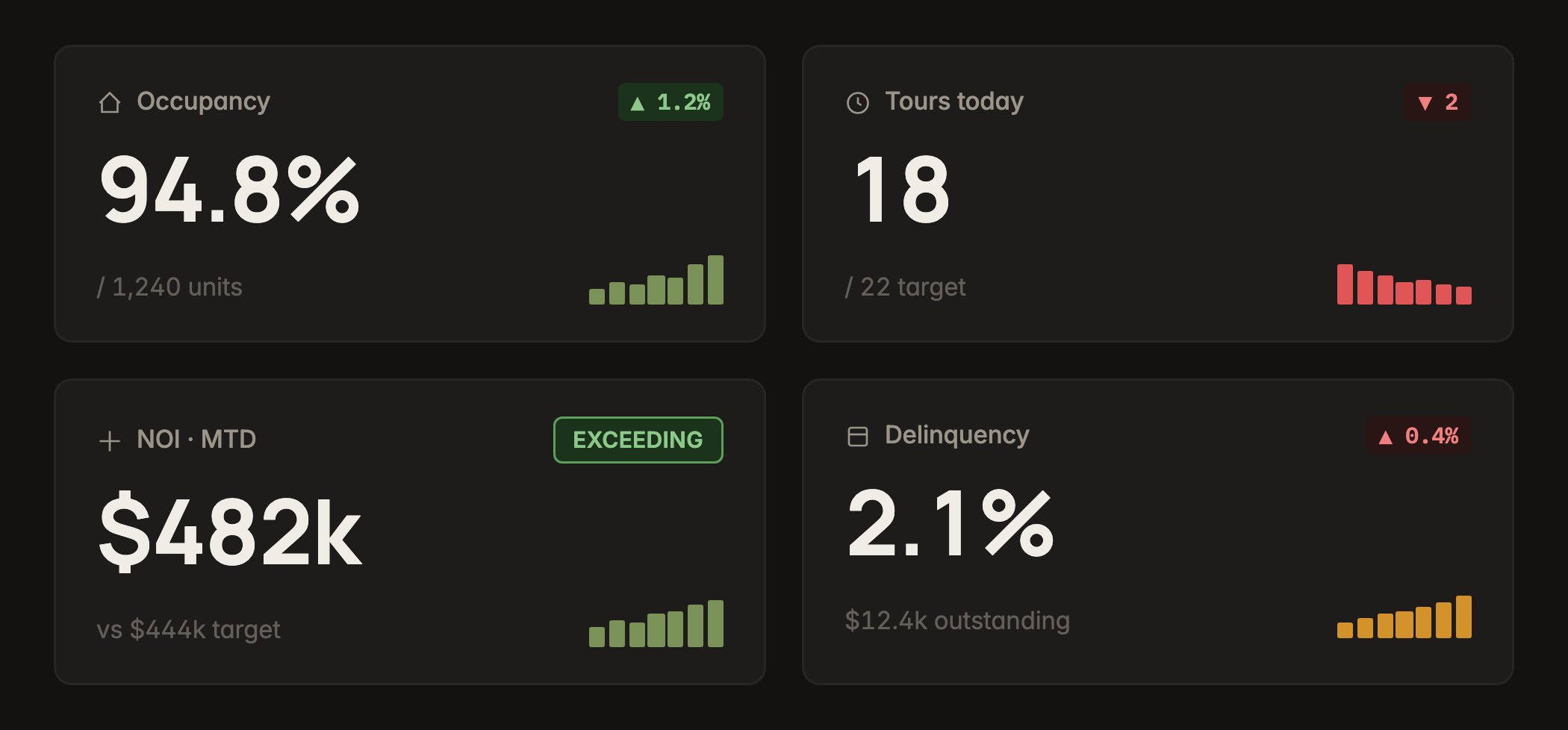
I built this system in Claude Design, then extracted it to the tokens and component CSS the products compile against. The specimens above are rendered straight from that CSS, so what you see is what ships.
On the go — the agent's mobile app
Leasing happens on foot, so we built the agents’ app from scratch in 2 weeks, and I decided what went in first. The feature I pushed hardest for was tour recording: it auto-summarizes the visit and sends the prospect a recap, so leasing’s highest-signal moment becomes data instead of a fading memory. Around it sit chat and calls, tour scheduling, prospect management, and the Copilot.
-
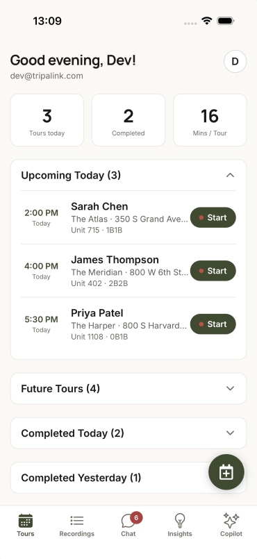
Today's tours, one tap to start
-
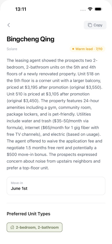
Tour recording → auto-summary
-
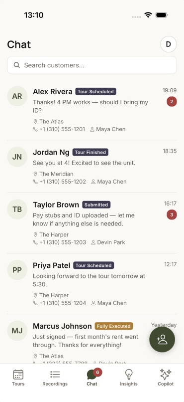
Every conversation, one inbox
-
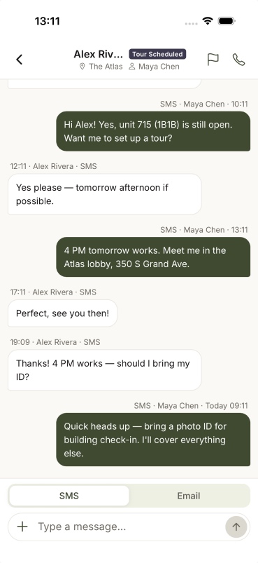
Message and call from the field
-
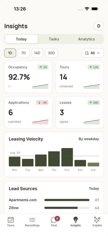
The funnel, in your pocket
-
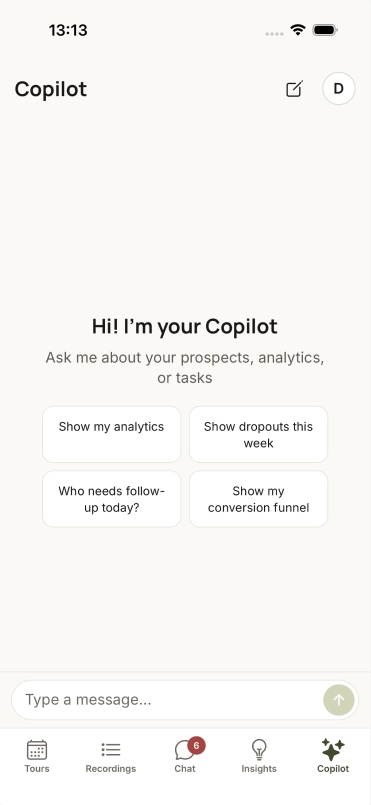
The Copilot, in a pocket
What it's done so far — honestly
79
Accounts on the platform
52 on the core dashboard (~66%)Pendo · May 2026
Month 2
First paying customer
Marketing product · March 2026one month after kickoff
~45 min
Analytics engagement
per user per weekhigh for B2B analytics
The portal is built and merged, but not yet cut over, and the convergence was a team effort I helped drive as design lead. What I’d measure next: funnel lift per segment, how many tours the AI books on its own, and whether the recap emails get opened.
Reflection
On the real problem
The system was the design problem
The interesting problem was never one screen. It was turning 3 fast, separate bets into one coherent platform without a rewrite or a drop in quality, because that’s what customers were asking for.
On the industry
Renters aren't one audience
Renters don’t want the same things, so the AI shouldn’t hand them the same answer. The segment work is where the product earns trust: a virtual tour for someone across the world, an honest alternative when a box isn’t ticked.