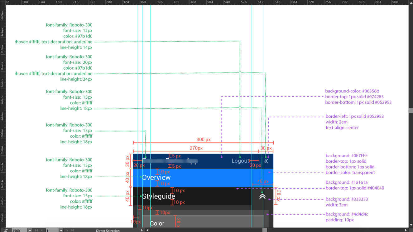
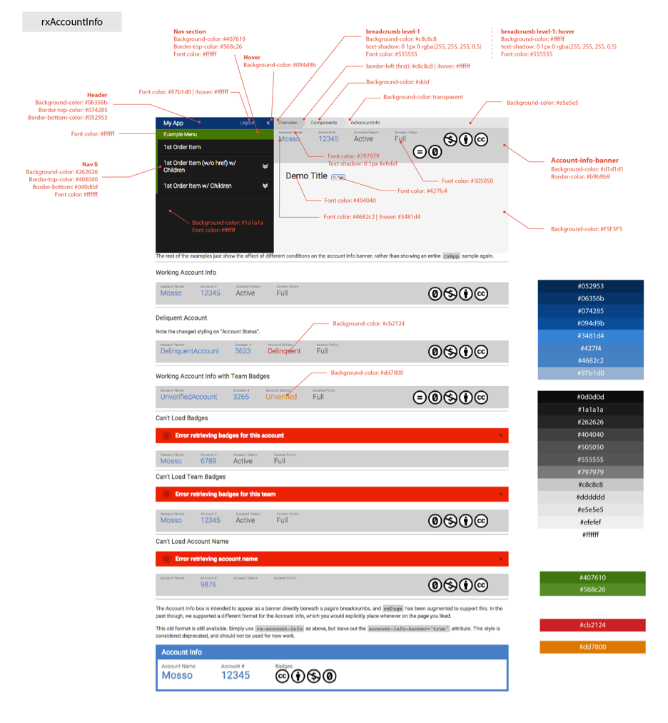
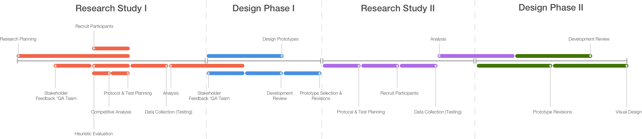
The two main problems of the existing site were a non-intuitive workflow and confusing taxonomy. Over two coordinated, iterative research phases, I researched users, ran usability testing, and redesigned the new-hire onboarding experience.
Rackspace · 2018 · Design Leader · UX Designer · User Researcher
Redesigning ServiceNow's new-hire onboarding at Rackspace
Researching users, running usability testing, and redesigning the ServiceNow platform around the new-hire process — across two coordinated research phases.
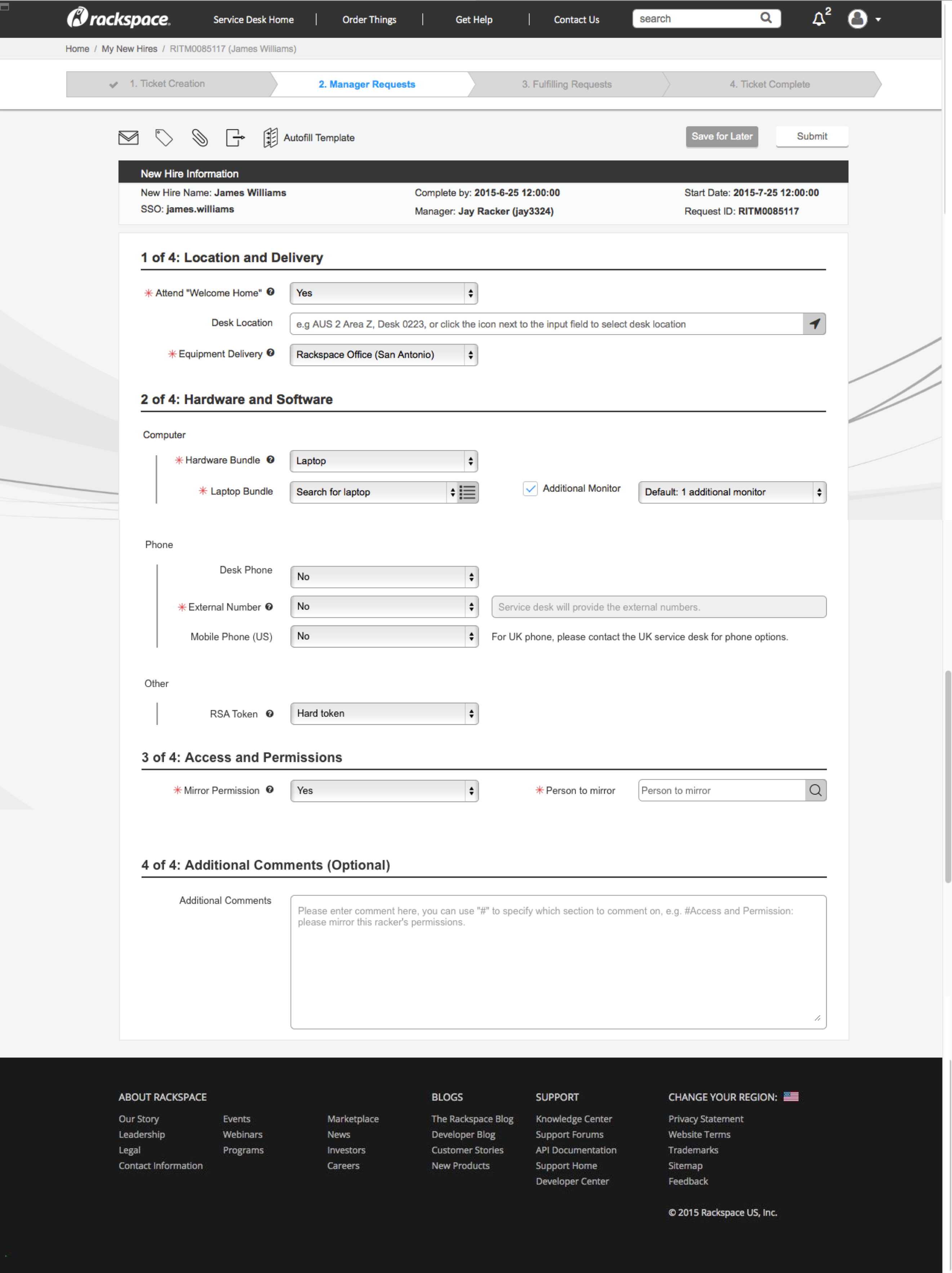
ServiceNow is a platform-as-a-service (PaaS) provider of enterprise Service Management (SM) software. Onboarding new hires is one of its most frequently used functions — through ServiceNow, managers assign equipment, set permissions for new employees, and track the onboarding process.
Research Study I
The ServiceNow New Hire Process redesign and research efforts were conducted in iterative, coordinated phases. During the first phase, generative research was conducted to determine key user needs. Following data collection, alternative designs were produced. The second phase of research was dedicated to evaluating those designs.
Phase 1 goals
01
Document needs and pain points
Document ServiceNow users’ primary needs and key pain points, focusing on the new-hire onboarding process.
02
Recommend a redesign
Provide a set of recommendations for redesigning the onboarding elements of ServiceNow.
03
Prioritize future work
Provide insights into what other elements or processes addressed through ServiceNow could be improved in later redesign efforts, and how to prioritize those efforts.
Heuristic evaluation
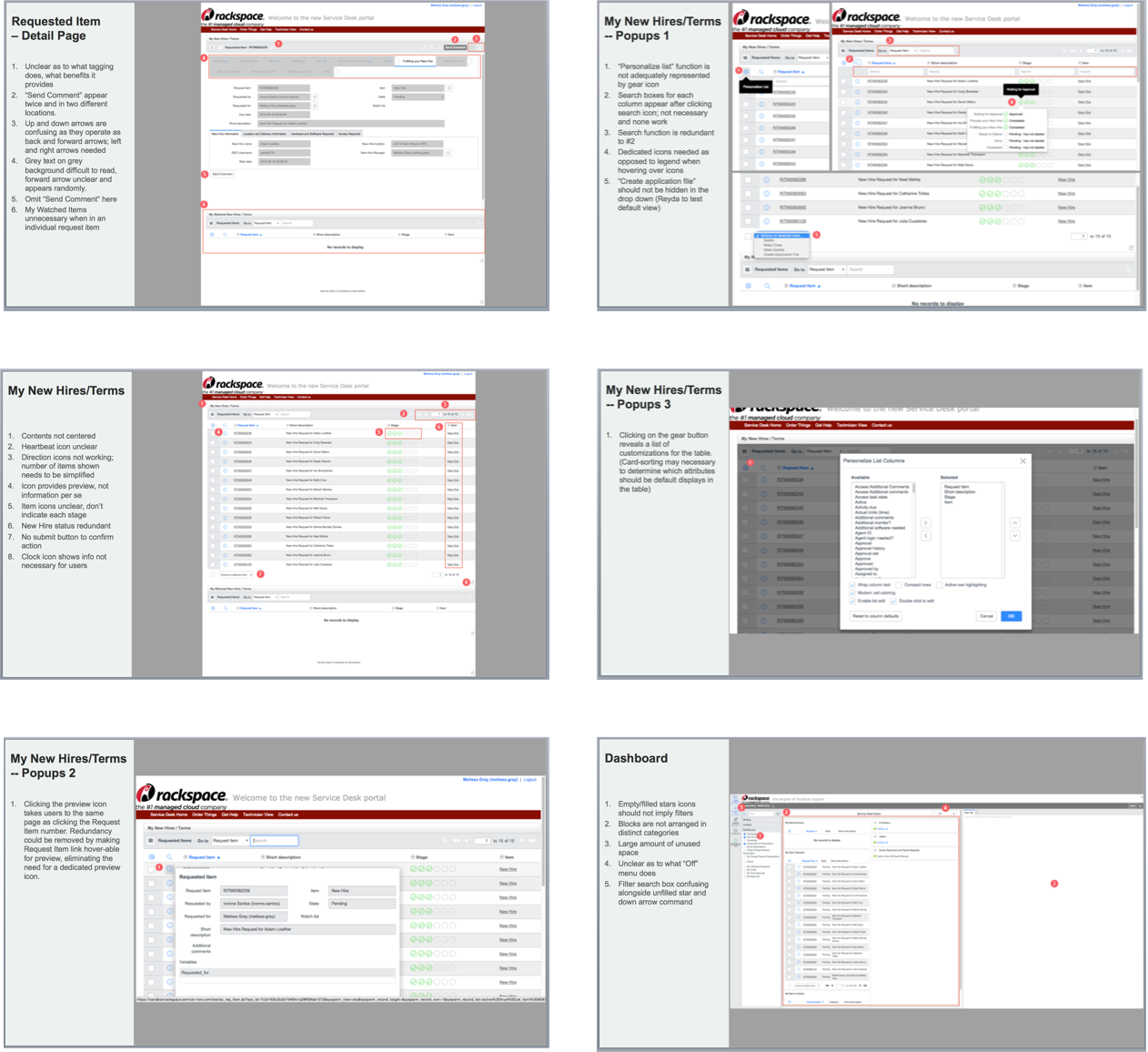
Prior to user feedback sessions, a heuristic evaluation was completed. This enabled the researcher to better understand the ServiceNow product, evaluate it against standard usability heuristics, and identify potential pain points for users during testing. The major issues surfaced:
Major issues from heuristic evaluation
Unused real estate
Lots of unused space on the screen.
Confusing icons
Icons are confusing or don’t work for HR.
Non-interactive info boxes
Info boxes that you can’t hover into or interact with, while holding lots of content.
Color contrast fails
Color contrasts fail.
Disorganized titles and navigation
Titles and navigation are not organized and are misleading.
Missing tooltips
Tooltips are missing or confusing — annotation is needed for some labels.
Heuristic evaluation screenshots
Annotated screenshots from the heuristic evaluation are shown below.
User feedback sessions I
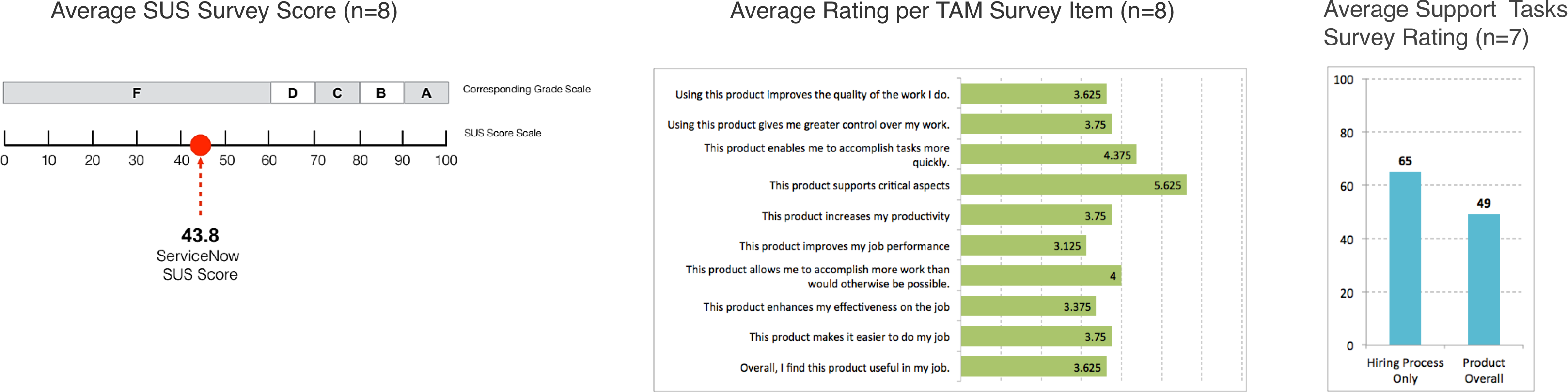
Methods: “Think Aloud” protocol (semi-structured usability testing), plus post-session surveys including TAM (Technology Acceptance Model), SUS (System Usability Scale), and STR (Supporting Tasks Rating).
8
Rackspace managers
Most had onboarded at least two new hires in the previous 6 monthsSessions lasting approximately one hour each
6
Teams represented
SMB Windows · Customer Programs · Cloud Office EmailFanatical Support · Interaction Design · Data Practice
During the first study, generative research was conducted with Rackspace managers, varying by department/team as well as experience level.
Findings and prototypes
Top findings & design decisions
Top findings
Link in email creates security concern
Tabs vs. one-page
White and grey color palette visually limiting
Iconography and labels not intuitive
Process progression unclear
Confusing commenting process
Permissions process unclear
Popup or panel often obscured
Design decision
Spell out the link
Smoother workflow / progress
Increase the color contrast
Find better icons and add tooltips
Redesign progress bar and indicators
Make comment interaction more obvious
Define mirror permissions
Create mouse-over and scroll function for popup
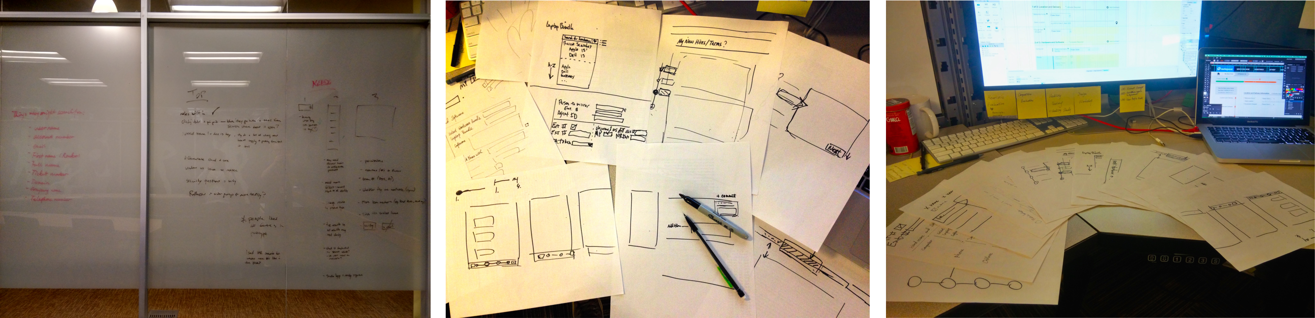
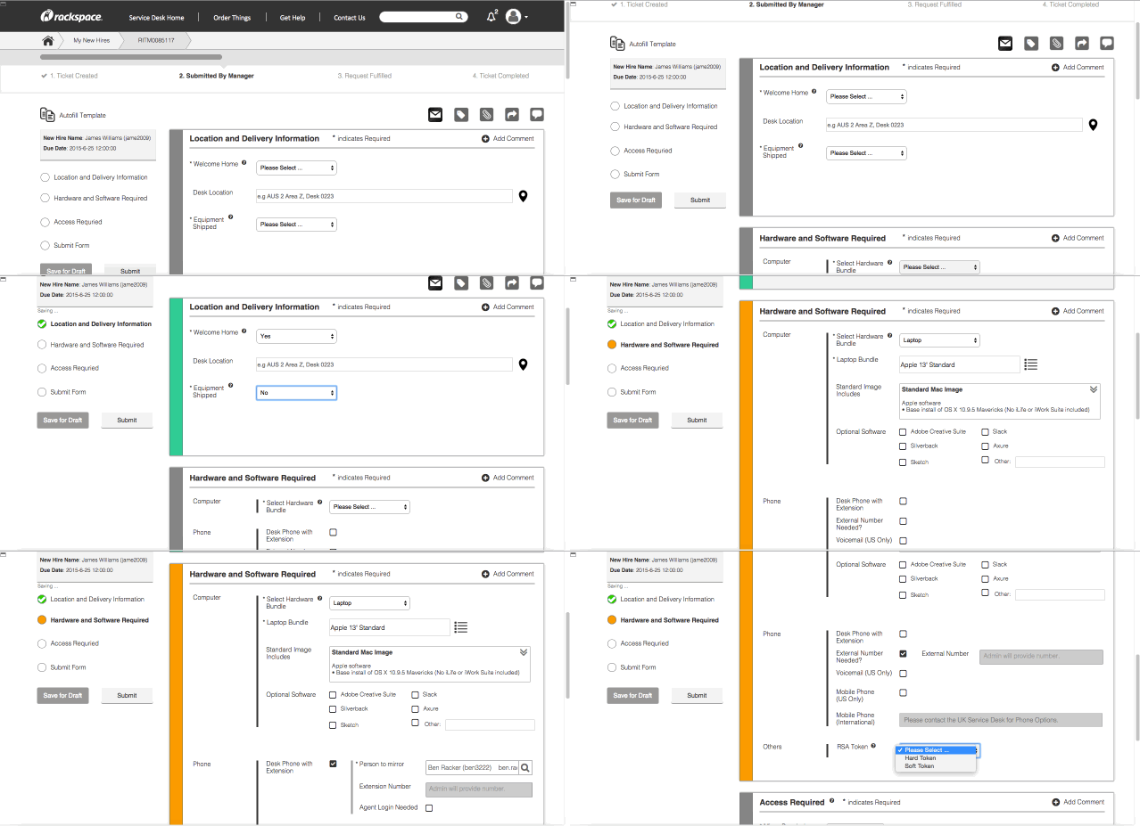
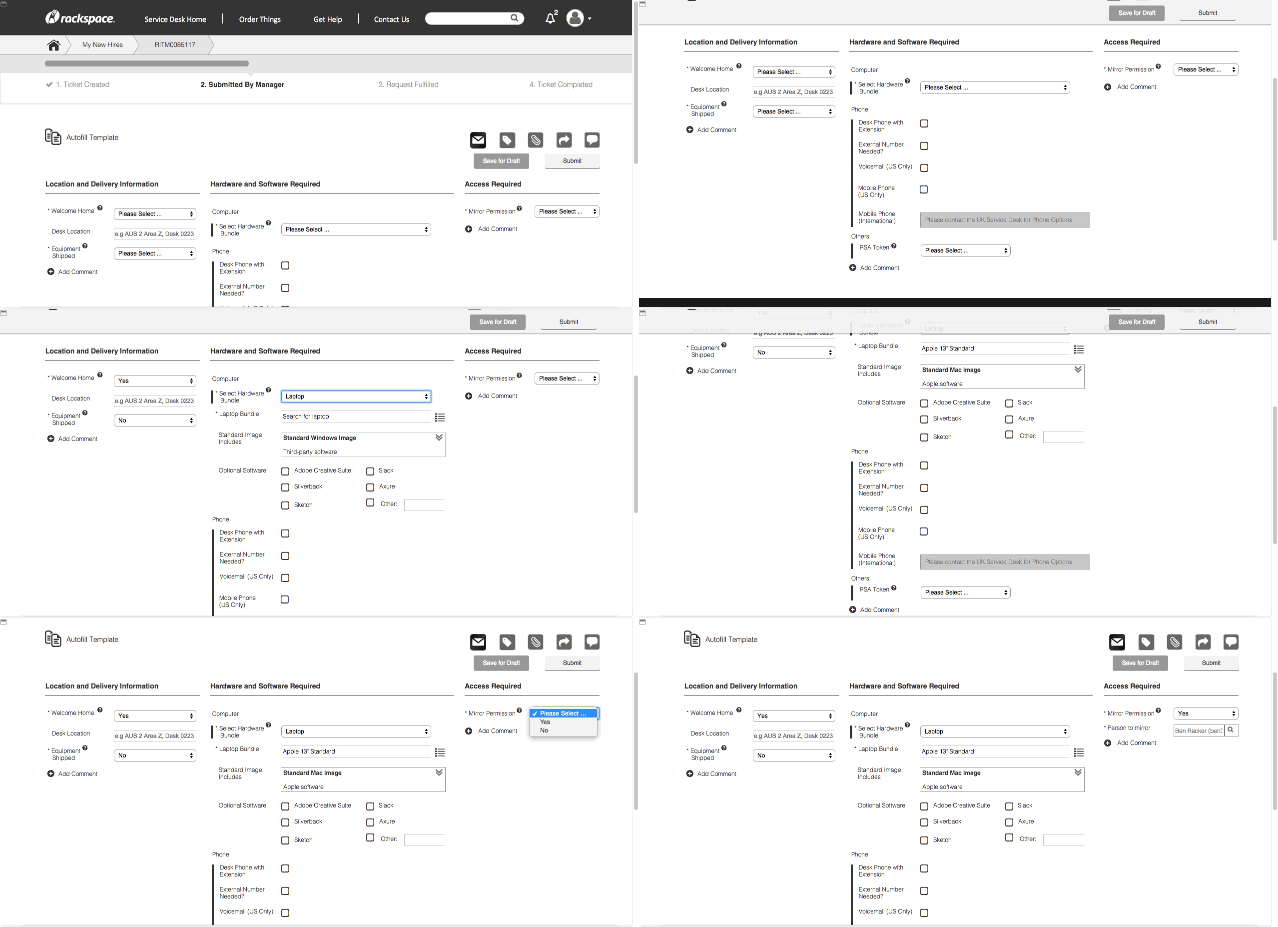
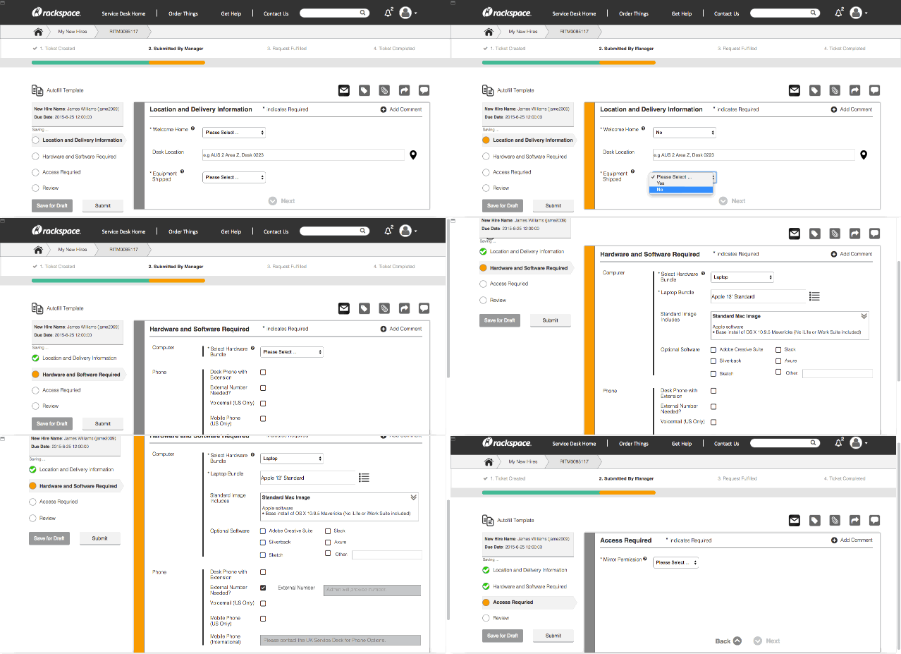
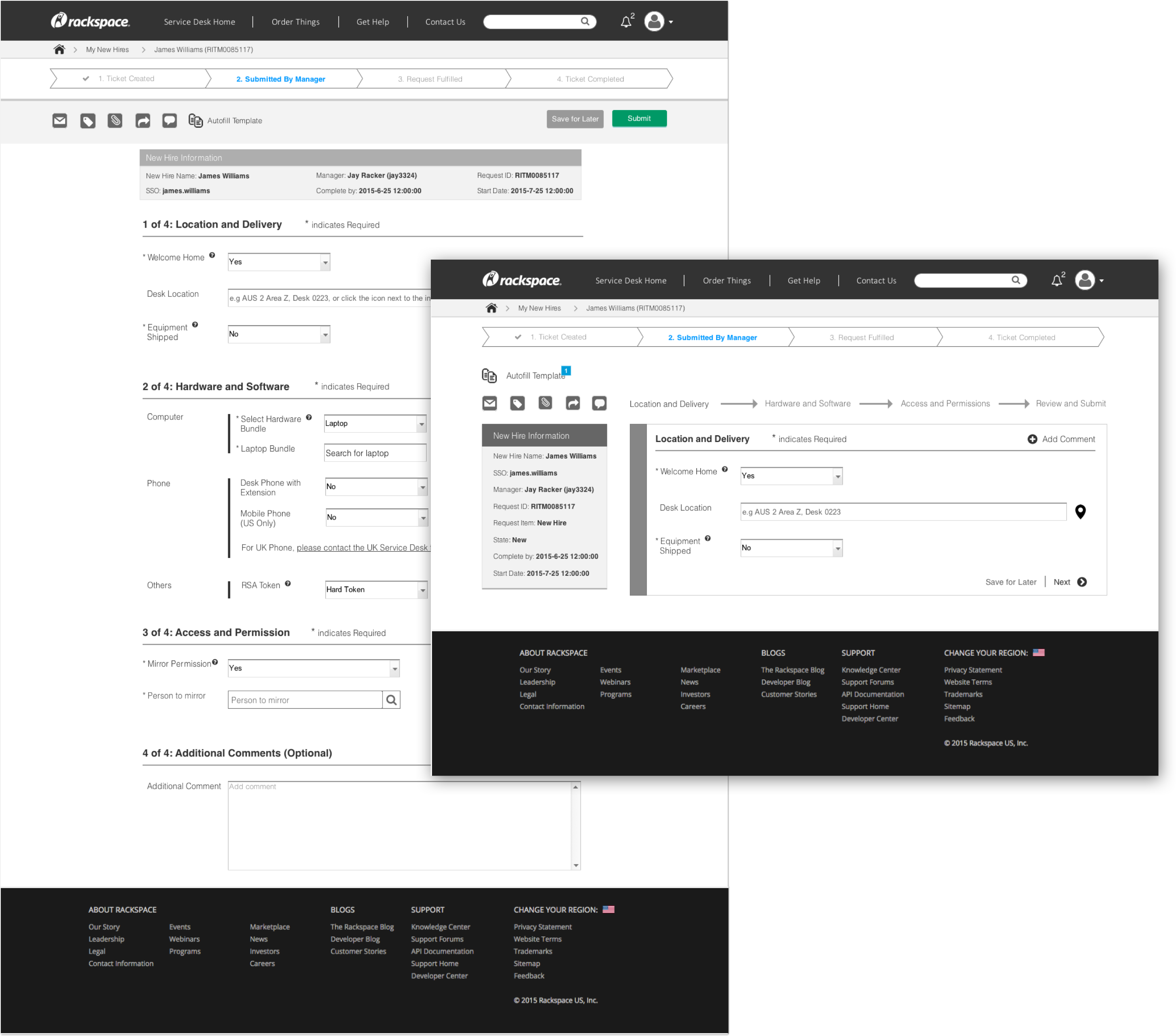
Four prototypes, narrowed to two
In total, we came up with four different prototypes. After we talked to a developer, we narrowed the prototypes from four to two. We finally picked version 1 and version 4, and revised them based on the developer’s feedback.
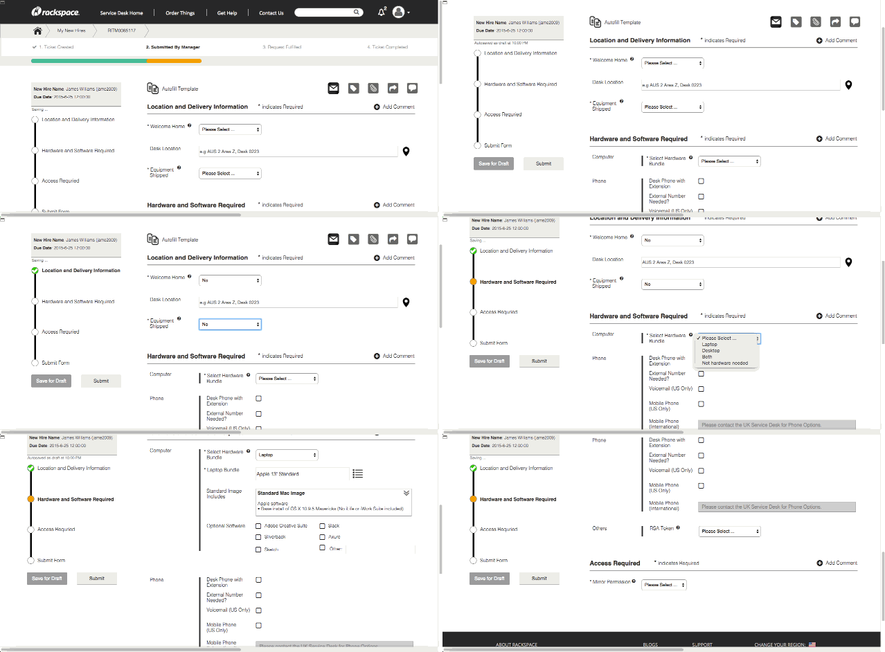
Version 1: single-page structure.
Version 2: single-page structure with collapse.
Version 3: single-page structure with three columns.
Version 4: multiple-page wizard structure.
Research Study II
During the second study of the project, two design concepts were chosen for evaluation and feedback from managers.
Phase II goals
01
Evaluate the redesign
Evaluate one iteration of ServiceNow redesign concepts and prototypes.
02
Recommend next steps
Provide a set of recommendations for ongoing concept and prototype development.
User feedback sessions II
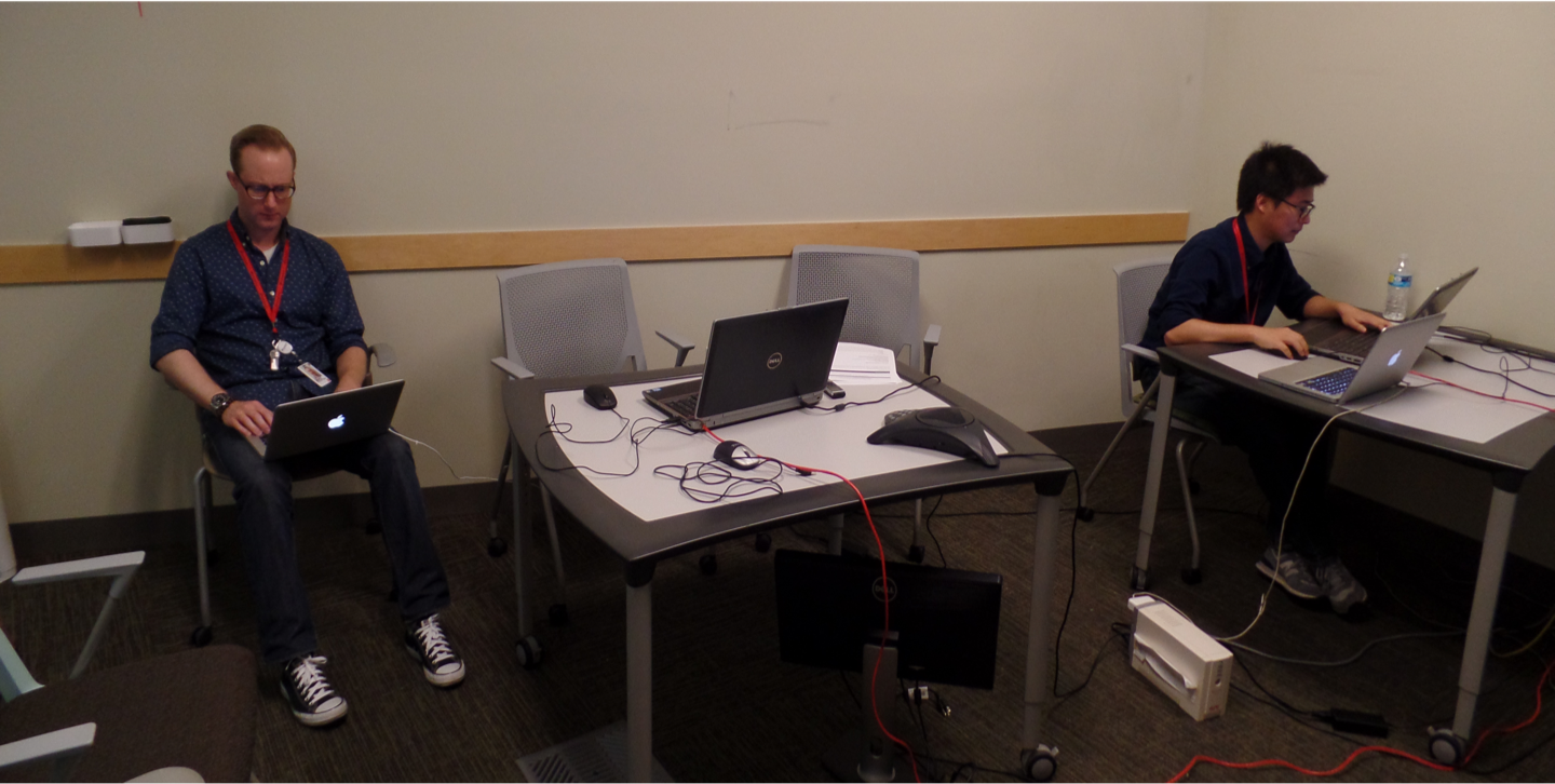
9 Rackspace managers participated in second usability feedback sessions, lasting approximately one hour each, with high-fidelity prototypes. Participants varied by department/team (e.g. different types of support groups, sales, investment) as well as experience level. After each session, on a scale of 1 to 100, participants rated each prototype based on how well they expected it to support them in the new-hire process.
Results: the rating for the prototype increased from 65 to 85. In terms of design preference, a slight majority (5 out of 9) preferred the single-page form; however, order effect may have been a contributing factor to participants’ preferences — 6 out of 9 participants preferred the second design they were presented with.
Top findings & design decisions II
Top findings
Labels still confusing to users
Confused by language of progress-bar stages
Concerns over logistics of desk location
Business costs of hardware selections
Desired to view permissions of mirrored Racker
Unclear or missing fields in submission process
Unsure how to create/edit autofill templates
Separate sections of Comment Center confusing
Desired status check of submitted ticket
Design decision
New labels and tooltip help throughout the form
Clearer wording to indicate ticket path and status
Select general area instead of specific location
Add informative icons and alert message
Able to display all permissions of a Racker
Scroll to and highlight the missing fields
Created more intuitive UI with role-based templates
Combined all comments into a single page
Provided live status updates and a comment section
Revised prototype
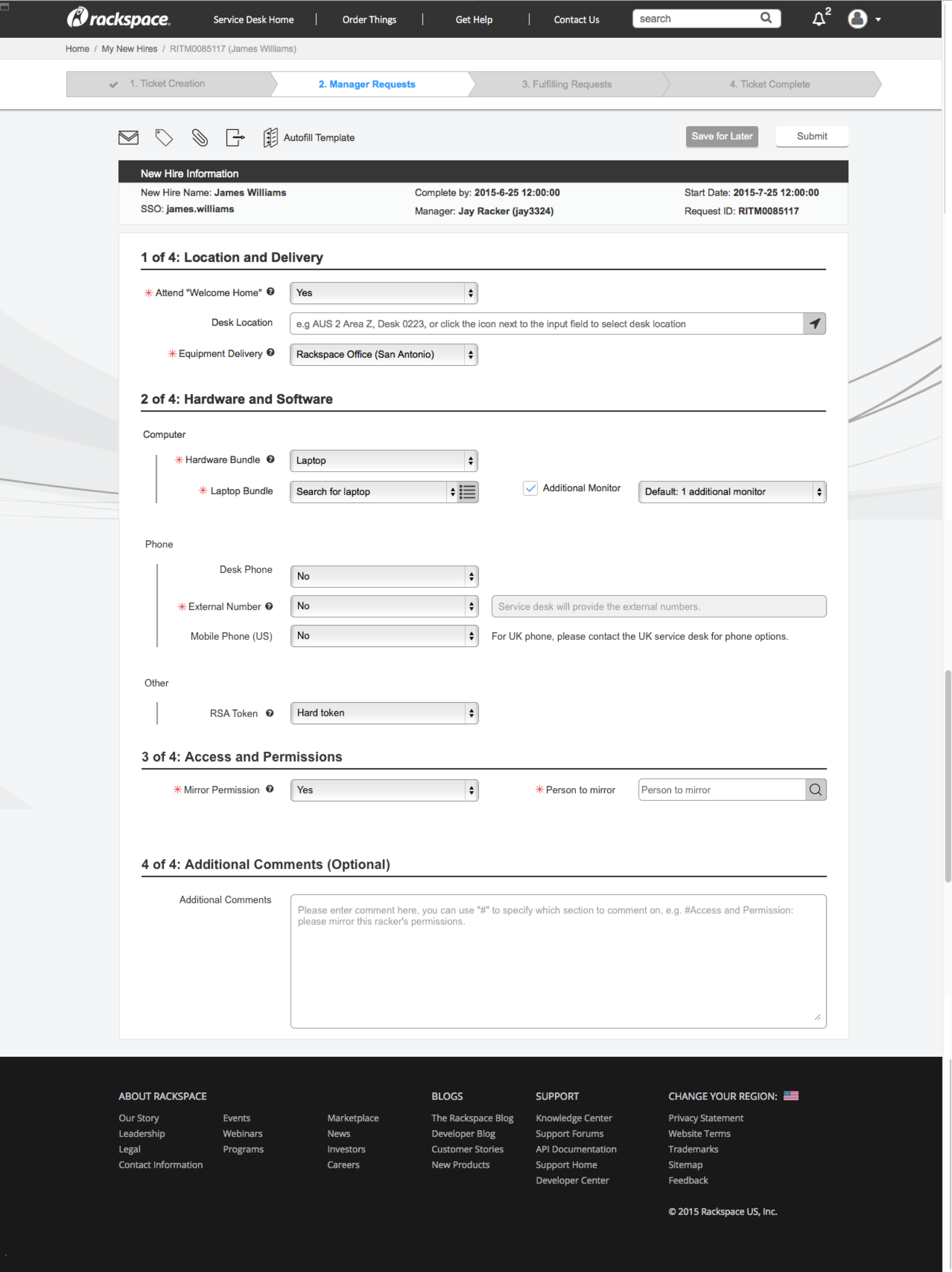
Form before submission.
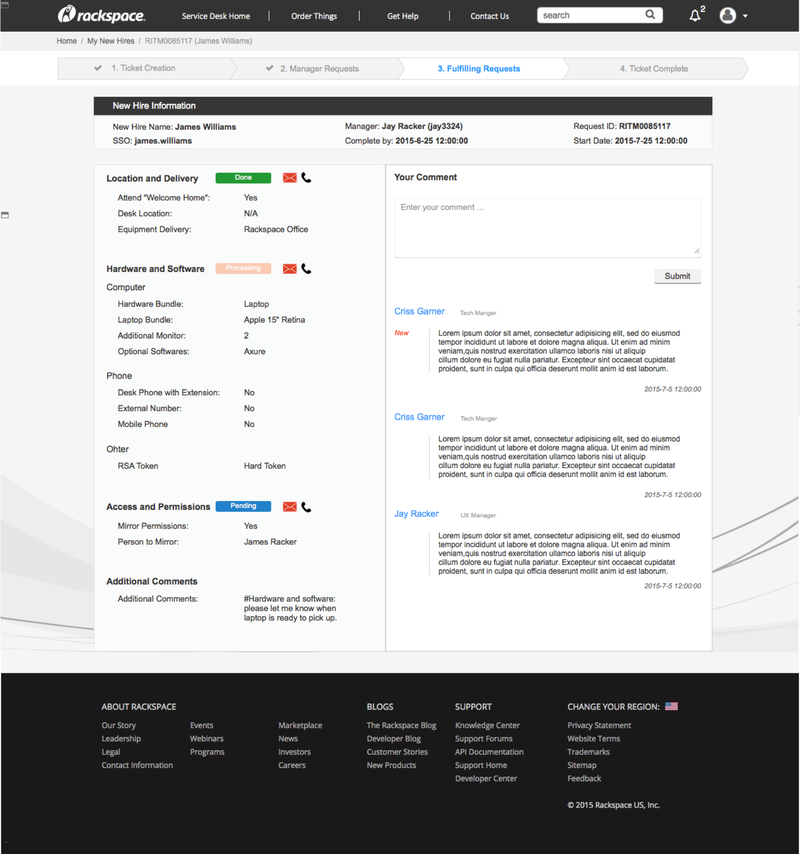
Status check after submission.
Other projects at Rackspace
In addition to the ServiceNow project, I also contributed to the development of the style guide to assist with the implementation of internal tools at Rackspace, and consulted with the company to build a high-fidelity prototype that created consistency between the customer website and the customer support website.