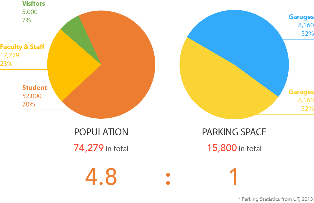
UT’s 2014 Parking Strategies Committee Report counted roughly 52,000 students, 17,279 faculty and staff, and 5,000 visitors against 15,800 parking spaces — a potential 4.8:1 ratio of people to spots. To take some pressure off, the university lets up to 4 people share a single parking permit and carpool in.
University of Texas at Austin · 2015 · User Researcher · Interaction Designer
T.E.A.M. Carpool
An iOS app that helps UT Austin students find a carpooler — and unlock the university's shared parking-permit policy most of them never knew existed.
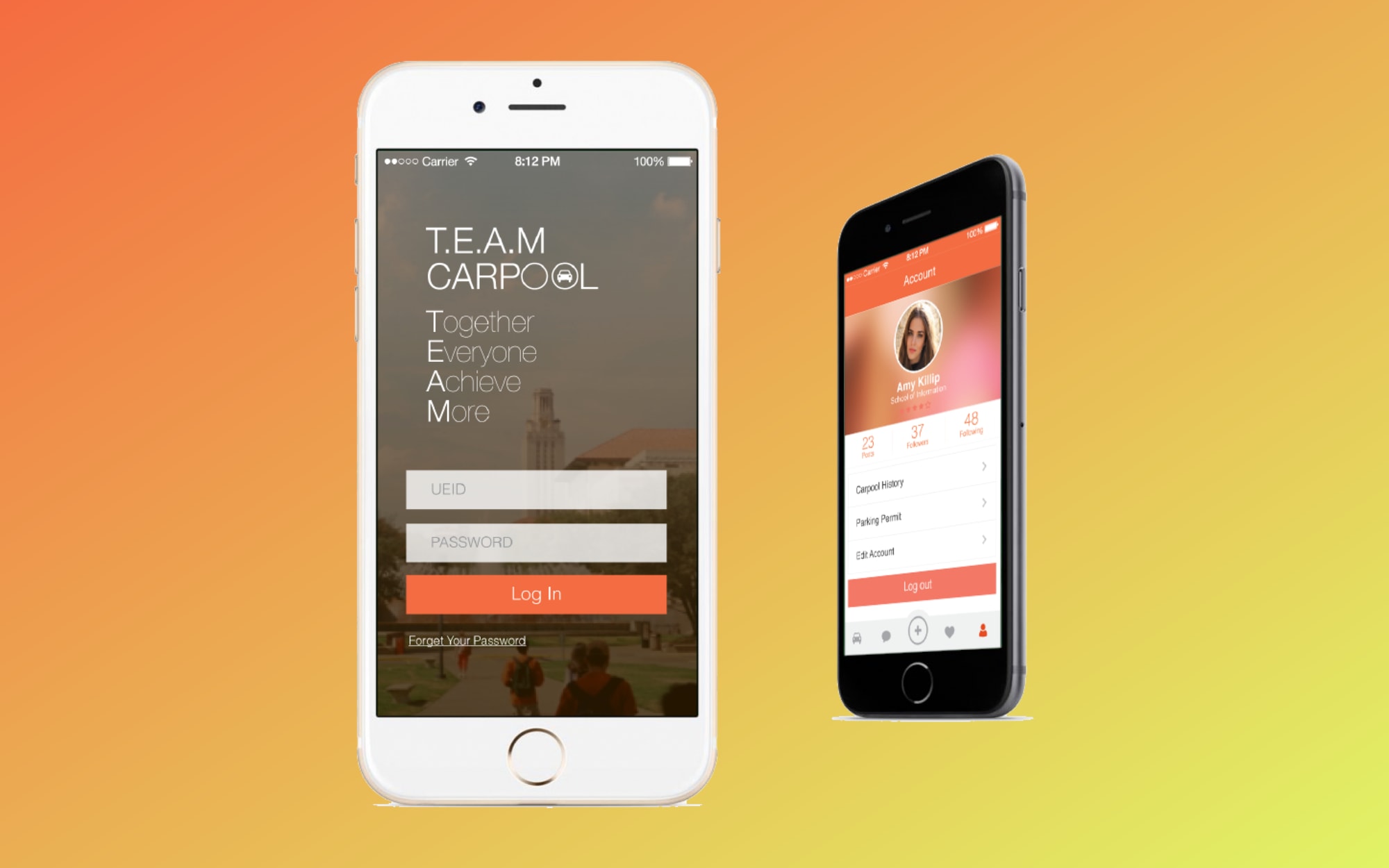
T.E.A.M. (Together Everyone Achieves More) Carpool is an iOS app that helps UT Austin students find a carpooler.
The trouble was that almost no one knew the policy existed, and even for those who did, the real friction came earlier: finding someone to carpool with. T.E.A.M. Carpool set out to make that match fast and easy, and to surface the permit benefit along the way — good for students’ time and money, and for the university’s parking crunch.
User research
A survey, two rounds of interviews, and a look at what already existed.
We opened with a survey and a round of interviews, gathering both the numbers and the stories — how students think about carpooling, how likely they are to try it, and which features would actually earn their use.
43
Survey responses
across the first round
5
Survey topics
demographics to difficulty
3
Competitors
Uber, Pool My Ride, Zimride
2
Interview rounds
broad first, then UT-focused
Learning from what exists
Before designing anything, we studied three apps in the space for their features, structure, and design. Each had something worth borrowing and something worth avoiding.
 Uber
Uber Strength Real-time tracking, clear city-rate pricing, and several payment options — Google Wallet, PayPal, a scanned card — plus driver ratings.
Gap You can't choose your driver before booking, and it's city-bound, not cross-state.
 Pool My Ride
 Strength Built-in messaging, Facebook friends and profiles, and an easy view of the route.
Gap Profile-view bugs, and it leans too hard on a required Facebook login.
 Zimride
 Strength Mutual friends and reviews let you vet a rider before sharing, and new messages surface to the top.
Gap Inconsistent ride posting, thin ride and user info, non-customizable profiles, and a map that kicks out to the Google Maps app.
What the survey turned up
43 students answered across 5 topics. The charts below summarize what they told us — who they are, how they’d carpool, and where it gets hard.
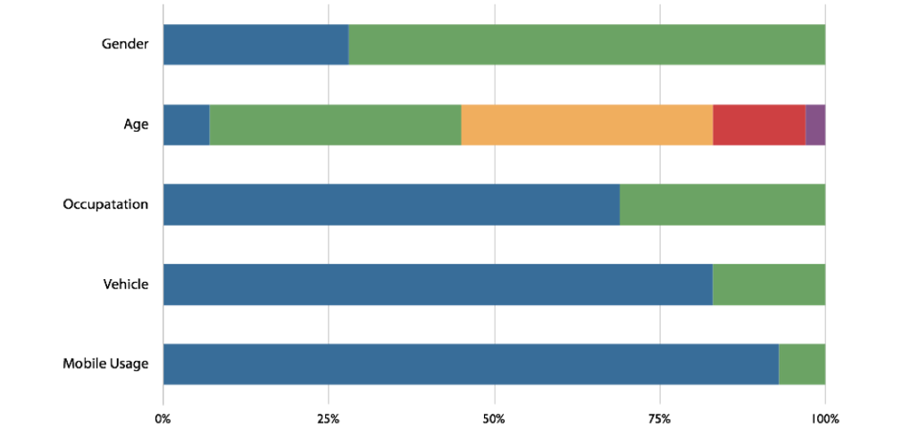
01
Demographics
Who answered — a cross-section of UT students and their commutes.
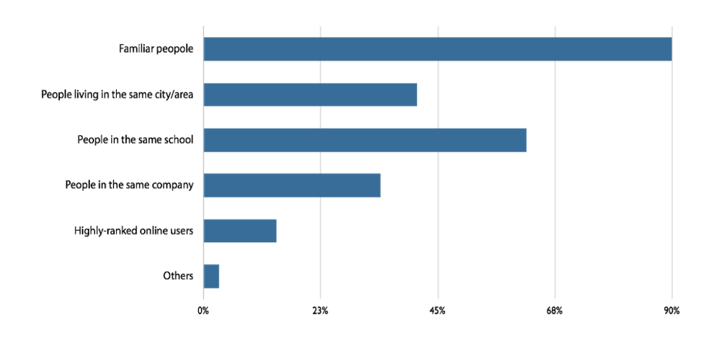
02
Carpooler type
Whether people would rather drive, ride along, or do both.
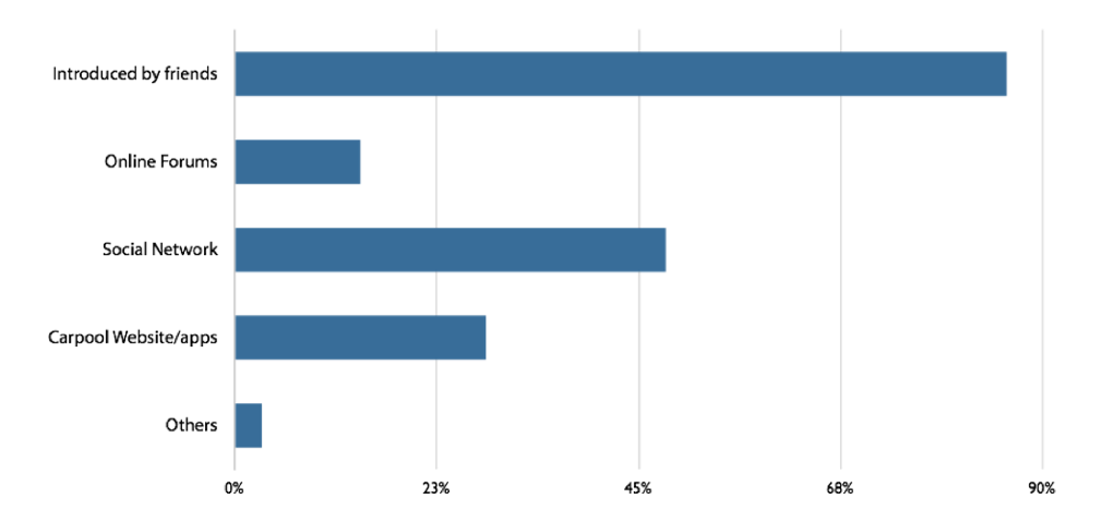
03
Way to find a carpooler
How students line up a ride today, from group chats to word of mouth.
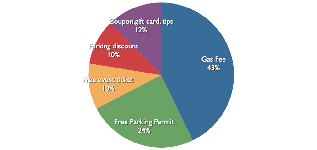
04
Reward wanted
What makes sharing worth it — gas splits, parking, or a simple thank-you.
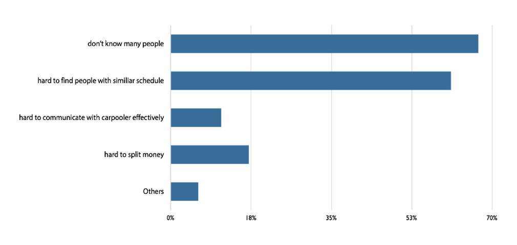
05
Difficulty finding a carpooler
How hard it actually is to find someone headed your way.
Narrowing the scope
After the first round we focused on UT students specifically, and folded the university’s carpool benefits into the concept — reserved carpool parking, reduced permit fees, and an extra UT shuttle pass.
A second, sharper round
A follow-up interview zeroed in on UT students and the tasks that mattered most: what they spend commuting, how willing they are to give or take a ride, how they’d split or reward gas, and how they’d want to find a carpooler or a driver.
Findings
We distilled the research into three artifacts, each pointing the design in a clearer direction.
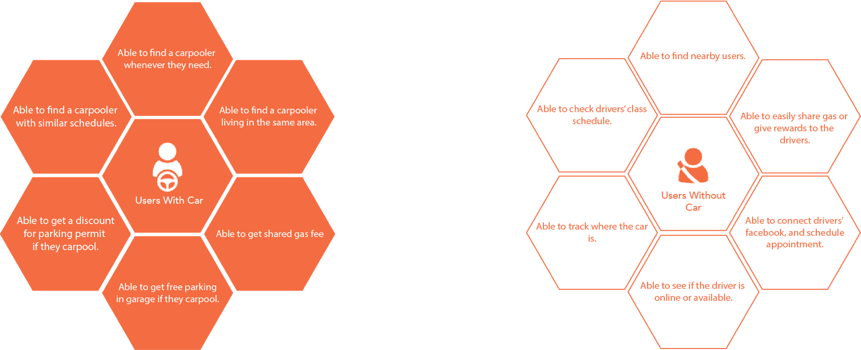
User needs
First, the needs themselves — the jobs the app had to do well for a match to feel worth the effort.
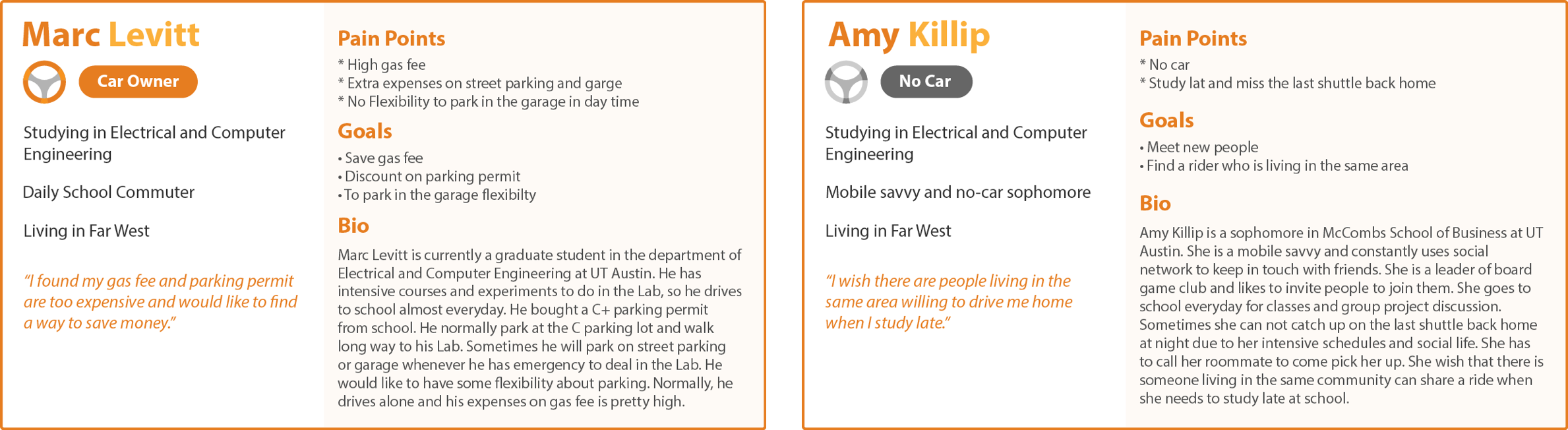
Personas
Then personas, so we designed for specific people instead of an average.
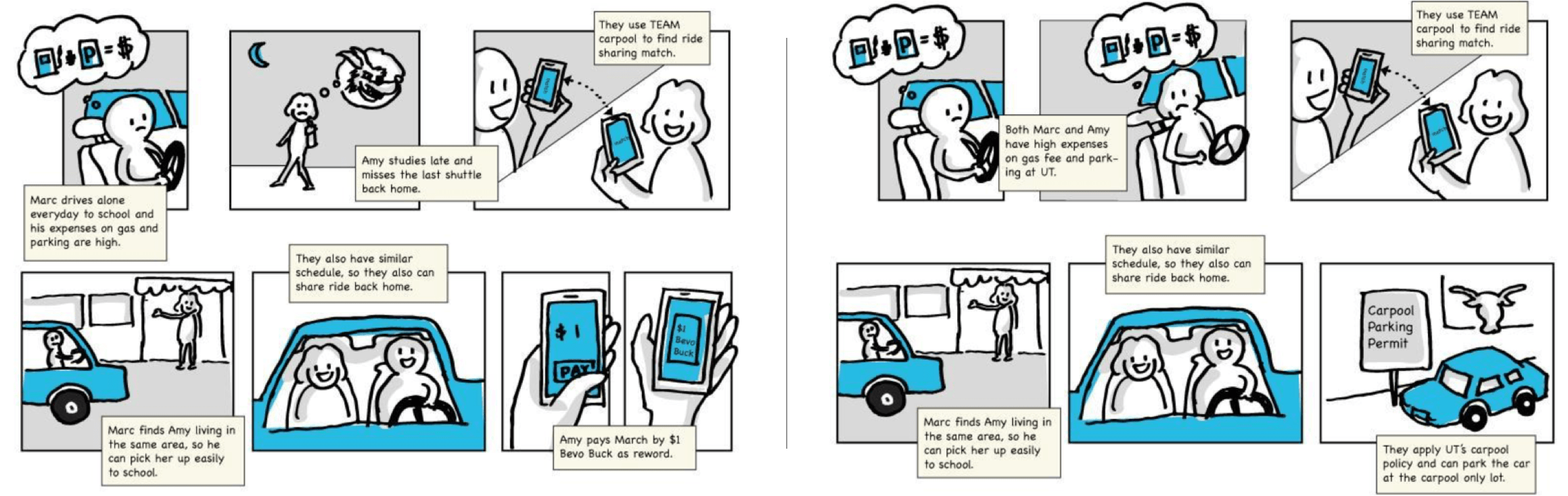
Storyboard
And a storyboard, walking through a day where finding a carpooler actually works.
Iterative design
From paper to pixels, one testable round at a time.
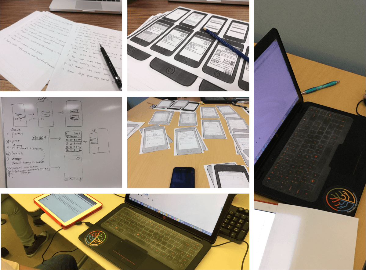
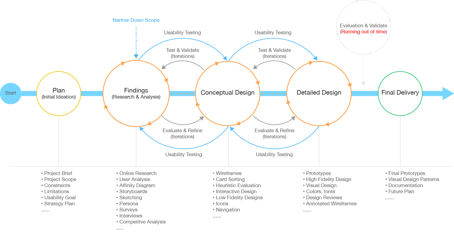
We set the blueprint first, then started rough — paper prototypes of the main flow. Across 4 rounds, from sketch to high fidelity, we tested each version and refined it, settling the content mapping and a controlled vocabulary as we went.
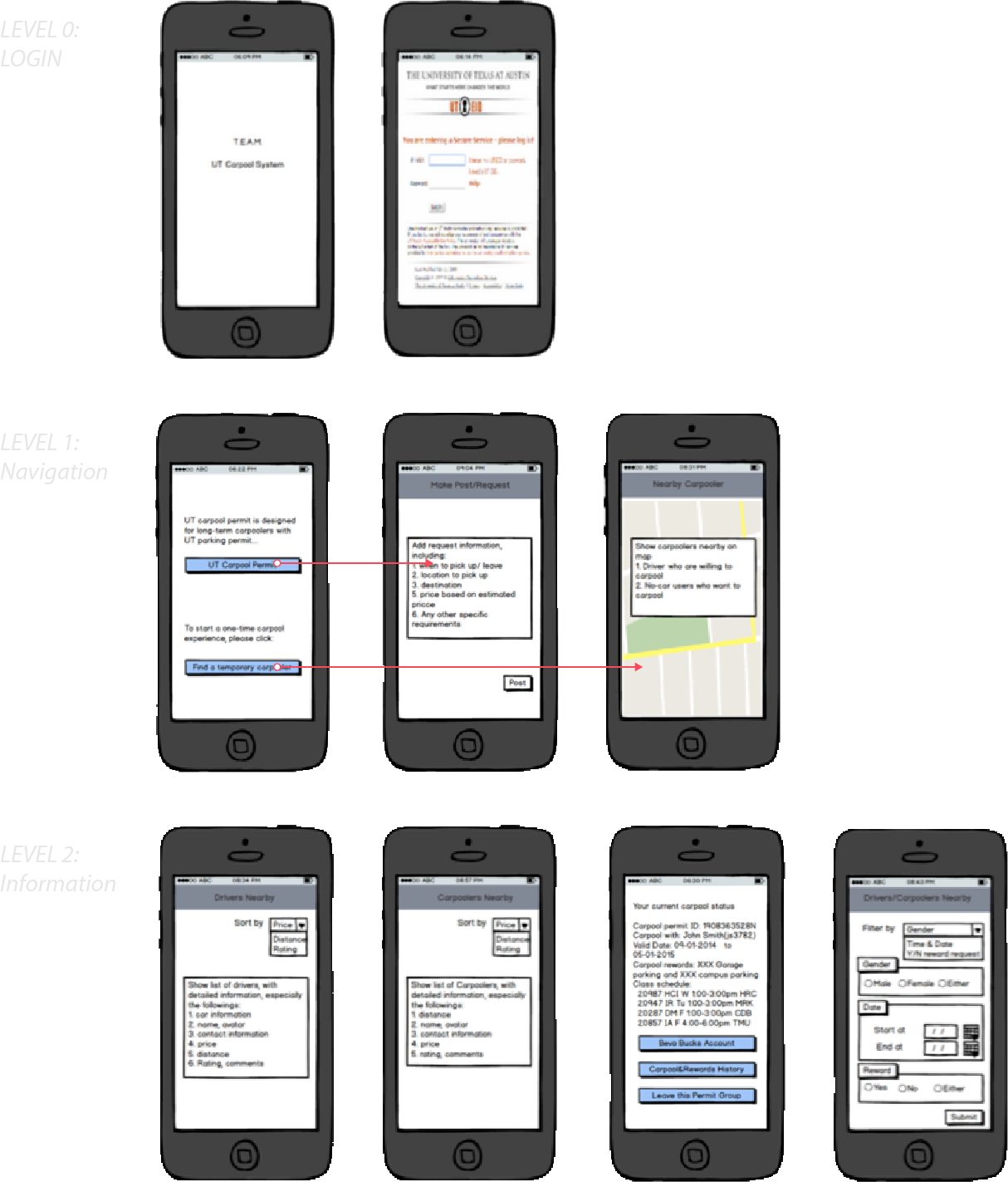
Early wireframes — Balsamiq
We blocked out the main flow in Balsamiq before committing to any detail.
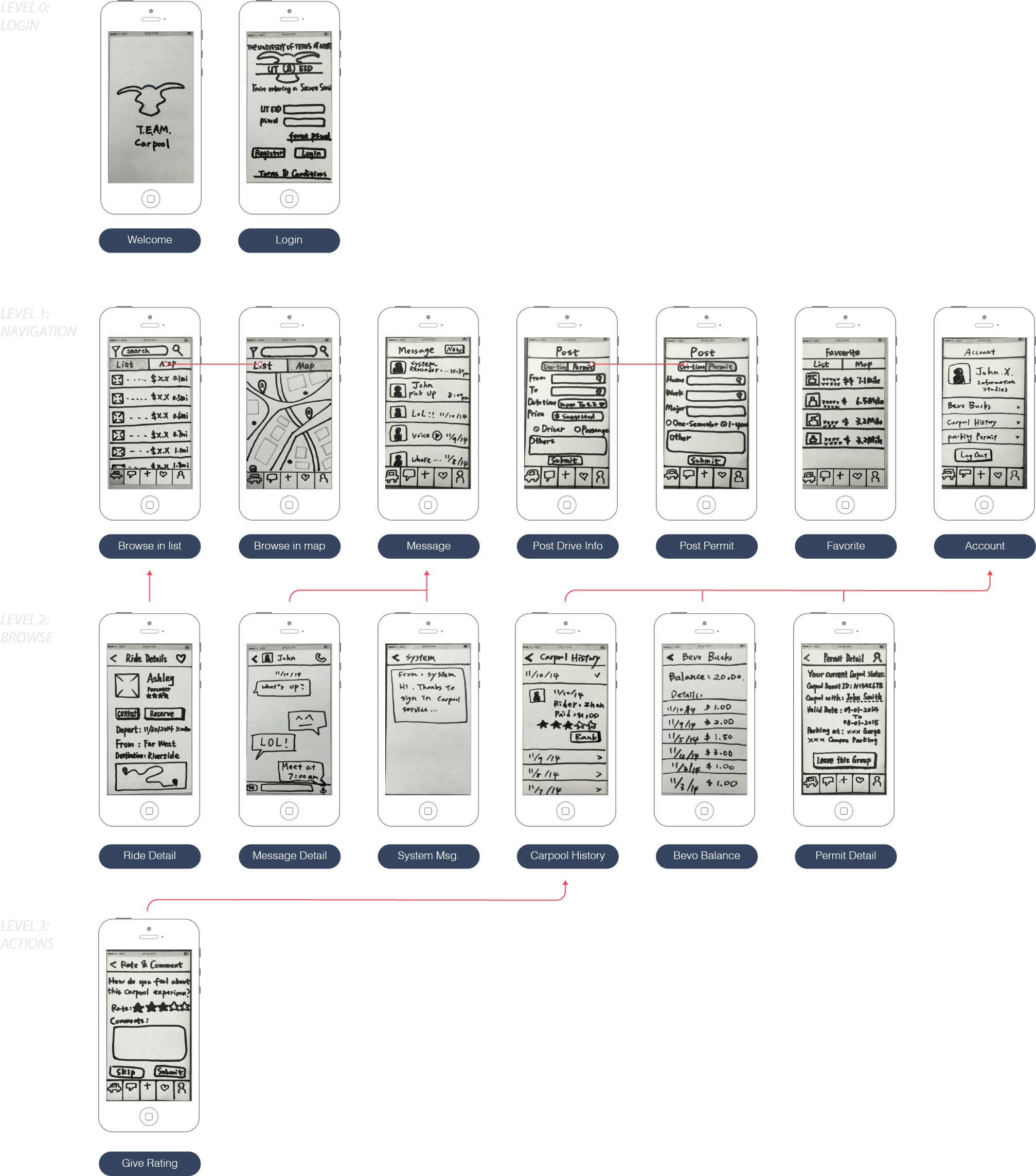
Paper sketches
Paper let us try layouts and interactions cheaply, then tear them up and redo them.
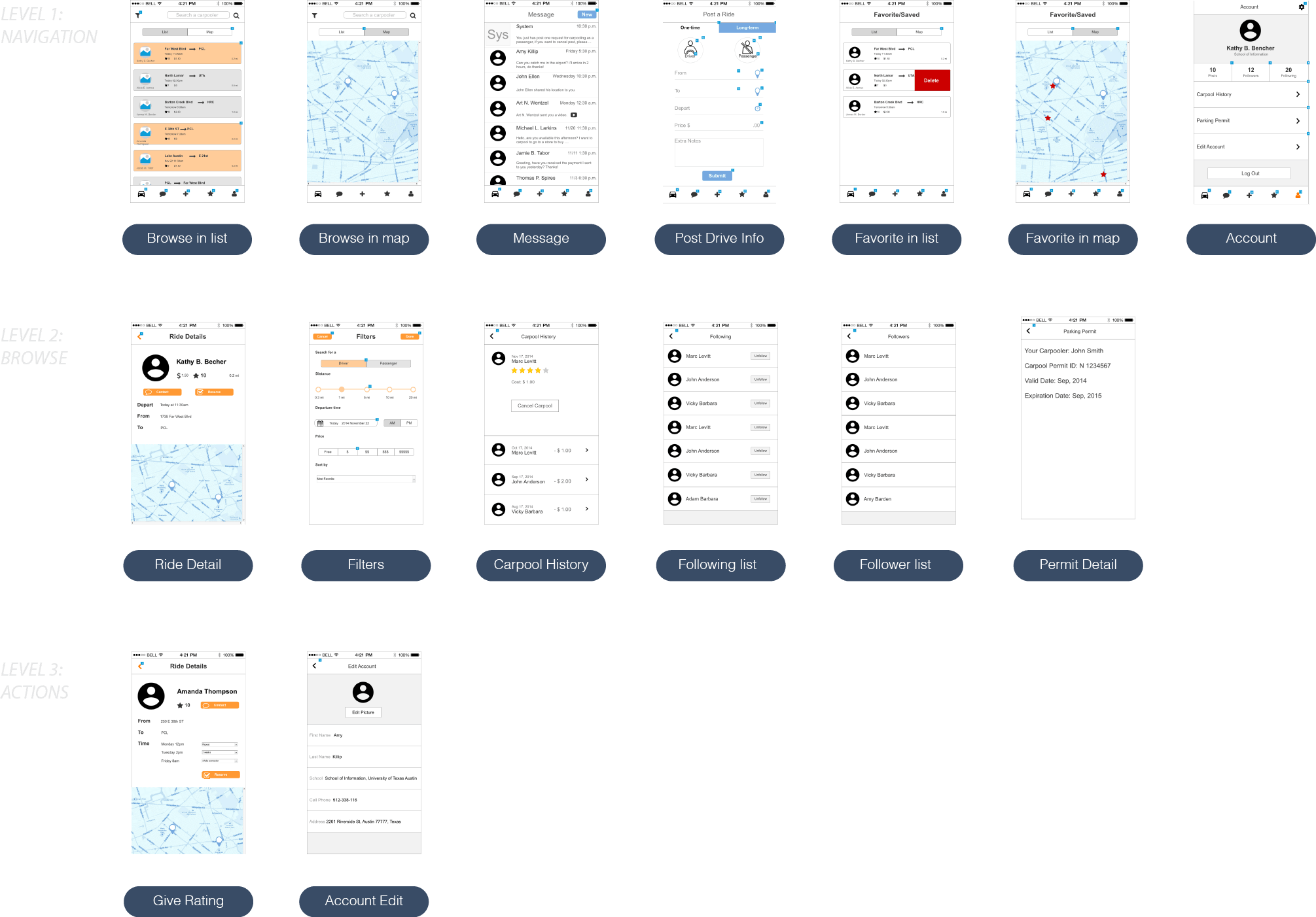
Medium fidelity — Axure
In Axure we tightened the structure and made the flow clickable enough to put in front of people.
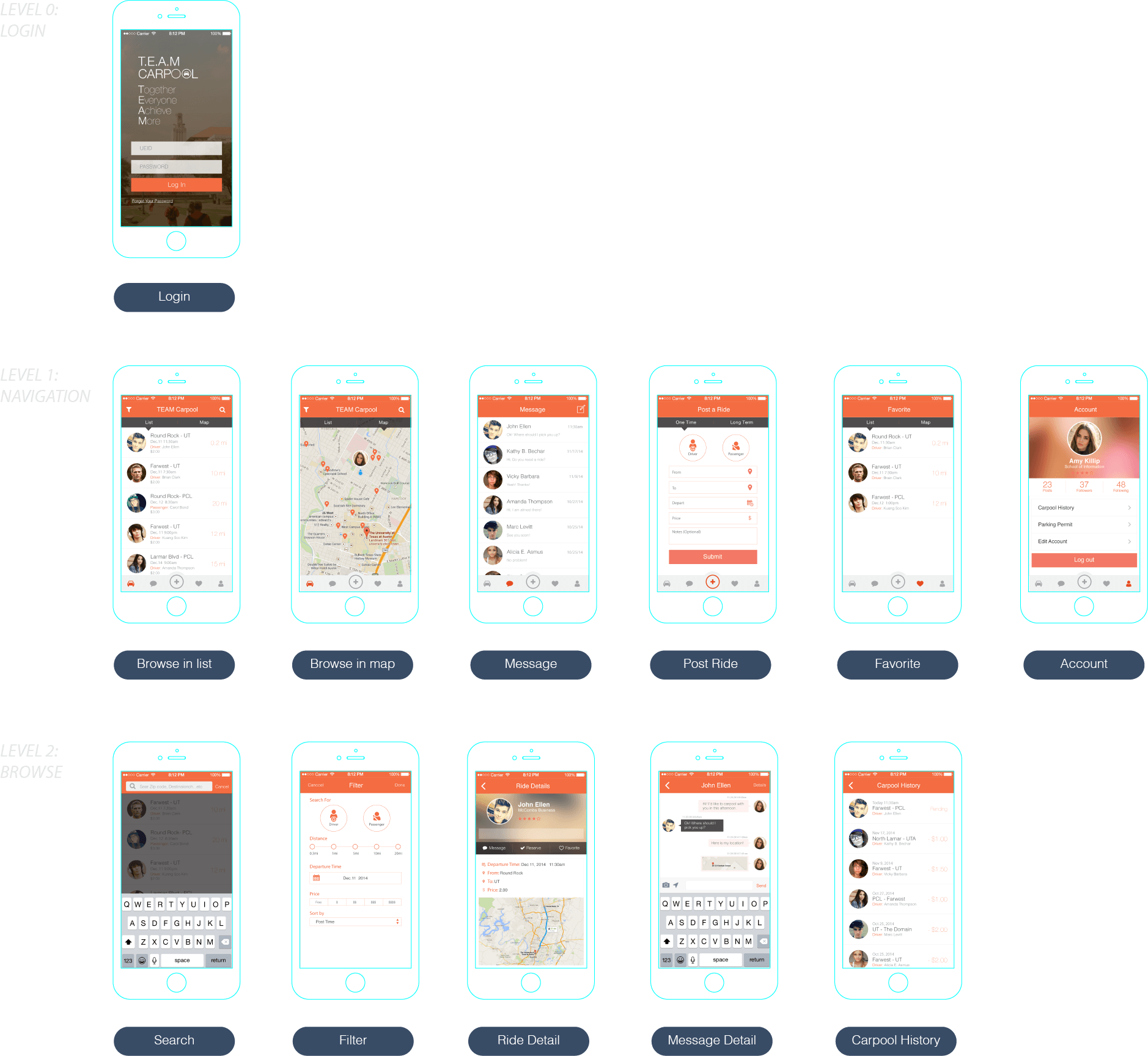
High-fidelity mockups
The final round brought the visual design together — the screens as students would actually see them.
Behind the scenes
T.E.A.M. Carpool was a team project for our MS in Information Studies, built over a semester of research, design, and testing. The name says the point: together everyone achieves more — and a carpool app only earns that if it makes the first match easy.