But customers often don’t know about the different Twilio regions and their benefits, so they build products in the default region (US1) even when it isn’t the best choice for data sovereignty or performance. The product was capable. The onboarding wasn’t.
Twilio · 2024 · Senior Product Designer
Onboarding Twilio's first international tier
How a US-only developer platform learned to feel global, in three deliberate phases.
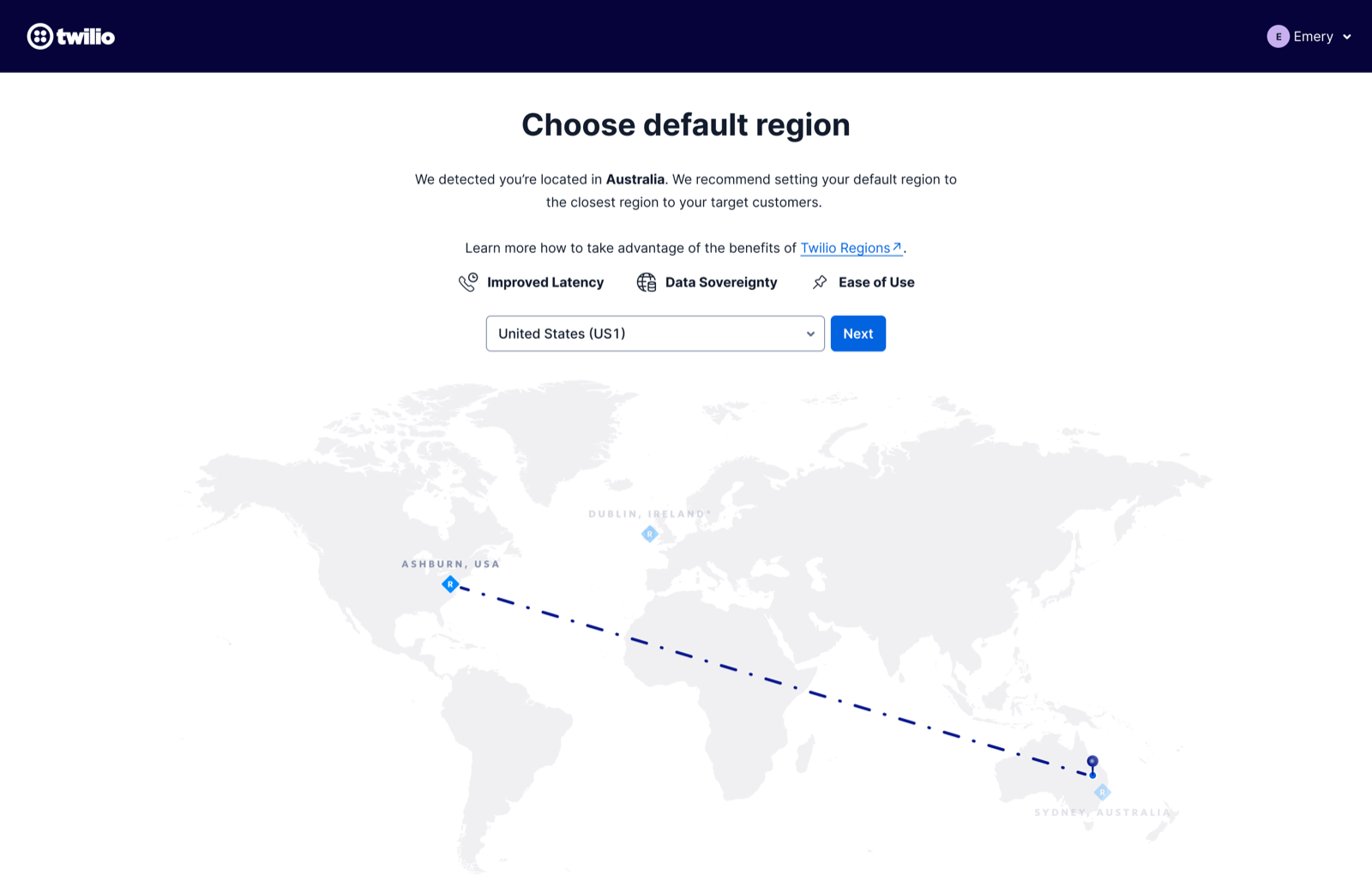
Twilio Regions lets users deploy apps in specific geographic regions — solving challenges for customers doing business outside the US, including data sovereignty, performance, and disaster recovery.
Why low adoption?
These are the top three pain points causing low adoption, based on the past research.
01
Lack of visibility
Twilio Regions is a relatively new feature, and many users are not aware of its benefits or how to use it.
02
Limited use cases
Users need to evaluate whether their use case justifies the use of Twilio Regions with limited features.
03
Technical complexity
Setting up Twilio Regions can be technically complex, as users need to re-route traffic in their application.
Job to be done
As a Twilio customer interested in developing an application for non-US customers, I want to be informed of the existence of different Twilio regions, so I can decide if building in a non-US1 region makes sense for my use case.
Looking around
How other products handle the same onboarding moment.
I took a look at other products’ onboarding flows to see if there were any pros and cons we could learn from.
 Plivo
Plivo Strength Guided tour to onboard users to build an application; provides a redact option to anonymize data.
Gap No tour specific to regions.
 Vonage
 Strength Simple steps to quickly onboard users, and only shows relevant guides. Links to the docs to explain how they collect data.
Gap Region is implied by the data-handling docs, not surfaced as an explicit onboarding step.
 Google Cloud
 Strength Shows tutorials in the right panel to guide users on how to set up their instance.
Gap Region is permanent once saved.
7 ideas, narrowed to 2
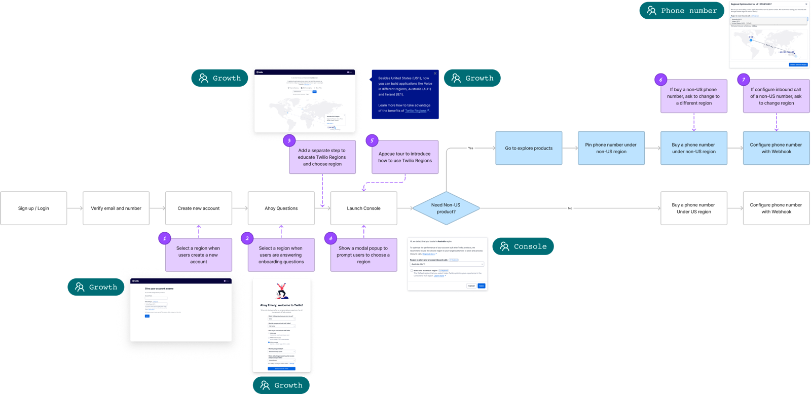
I mapped out the current onboarding flow and brainstormed possible solutions on the user flow — 7 places to introduce Regions.
- 01 Choose region when naming account
- 02 Choose region in Ahoy questions
- 03 One pager for region selection between Ahoy and Dashboard Tested
- 04 Region selection modal first time in Console
- 05 Appcue tour in Console
- 06 Confirm region when buying a phone number
- 07 Confirm region when saving phone number configuration Tested
Following consultations with RAPID (Recommend, Agree, Perform, Input, Decide) stakeholders — including Global, Growth, Console, and Phone Number teams — we decided to proceed with options 3 and 7 to run usability testing.
Surviving design critique
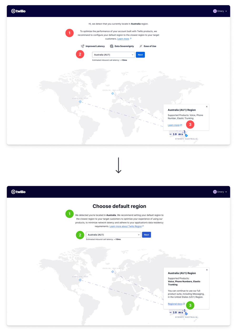
Prior to conducting usability testing, I sought design critiques and clinics to receive feedback on my designs. These are two examples of the critical feedback I received and the changes I made based on it.
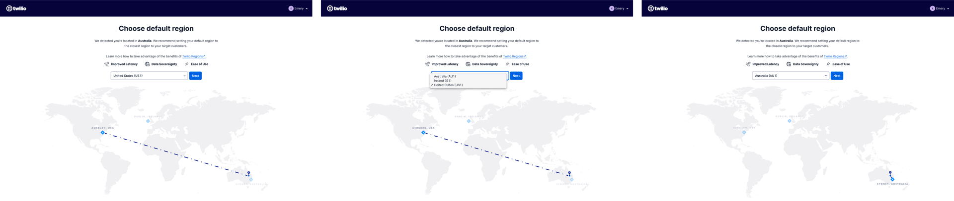
Critique 01 · One pager for region selection between Ahoy and Dashboard
Without a label, customers were confused about what they were configuring
Changes
- Added the title “Choose default region” to the page
- Updated copy to make the benefits of the default region clearer
- Added a popover when users pick a region to explain what's supported, with the text: “You can continue to use our full product suite, including Messaging, in the United States (US1) Region.”
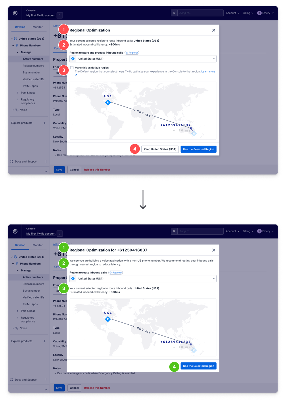
Critique 02 · Regional optimization modal after saving phone number configuration
The informative modal was too informative and did too many jobs
Changes
- Removed the default-region setting from the modal (the concept itself could be confusing to customers)
- Added a number to the modal title to make it more relevant
- Added an explanation of why the modal shows up and its benefits
- Consolidated the two confusing buttons into one for the selected region
Validating with usability testing
10
Participants
4 current, international Twilio customers6 international non-customers
2
Objectives
Evaluate regional onboarding and configuration conceptsDetermine what features would make Default Region useful for customers
Key findings
Finding 01
Complex onboarding
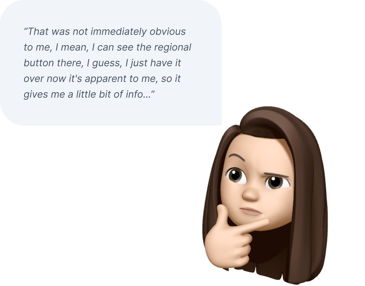
Choosing new regions might be complicated — I don't even know if someone needs to choose a default location.
Finding 02
Default Region misleading
Setting the Default Region will impact the language [display] and billing [i.e., what currency I'm billed in].
Finding 03
Confusing routing concept
Do I need to have the same setup in the US and Australia?
Recommendations
01
Further research
Partner with Growth and CX to continue research into the customer’s experience between the Evaluate and Acquire phases.
02
Re-evaluate Default Region
Consider removing the Default Region concept from the Console and its functionalities.
03
Phased approach
Phase Regions into the Console and evaluate customer response at each stage of maturity.
A phased approach
Based on the research and the discussion with relevant stakeholders, I came up with a phased approach to strategically onboard customers with Twilio Regions.
01
Phase 1 · Shipped
“👋 Ahoy, we have Twilio Regions for you”
Increase exposure of Twilio Regions and educate on its benefits without disrupting the current customer experience — a guided tour that pins the region based on location, plus regional docs added to the last step of the self-serve flow.

02
Phase 2 · Planned
“🤔 You might want to use Twilio Regions”
Nudge customers when we know they can gain benefits from Twilio Regions — surface a routing suggestion in cases where we believe it can be optimized.

03
Phase 3 · Planned
“😍 You're gonna love using Twilio Regions”
Proactively optimize the regional experience for customers from the get-go — regional configuration as a part of the initial setup flow, and a regionalized Console experience.
The outcome
+179%
Increase in regional Buy a Number page impressions, three months since Phase 1 launch
Phase 1 shipped to increase exposure of Twilio Regions; Phases 2 and 3 are planned. The Default Region concept itself is under re-evaluation based on what customers said about it during testing.
What I learned
On decision making
RAPID decision-making framework
Use the RAPID decision-making framework to identify the key roles — Recommend, Agree, Perform, Input, and Decide — and the associated deliverables at the beginning of the project.
On strategy
Strategic, phased thinking
It’s not always possible to achieve a design all at once, especially when there are numerous dependencies and constraints. Consider taking a phased approach that gradually works toward the north star.