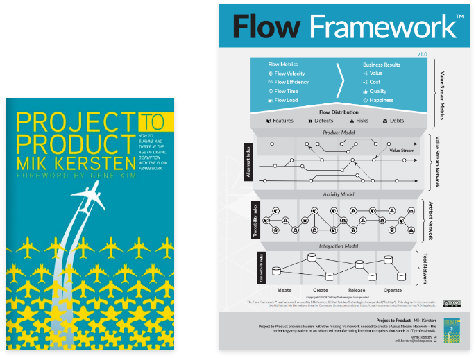
In 2018, Tasktop CEO Dr. Mik Kersten wrote a market-developing book called Project to Product — I assisted the CEO with designing the interior graphics and the Flow Framework™ diagram. It introduced how organizations move from a project-oriented to a product-oriented model to survive and thrive in the age of digital disruption, using the Flow Framework™ as a blueprint.
Tasktop · 2021 · Senior UX Designer · Design Lead
Building Tasktop Viz, a flow-metrics tool from zero
Designing the first purpose-built tool to implement the Flow Framework™ — giving leadership visibility into product value streams and teams actionable insight, with limited time, vague needs, and a lot of unknowns.
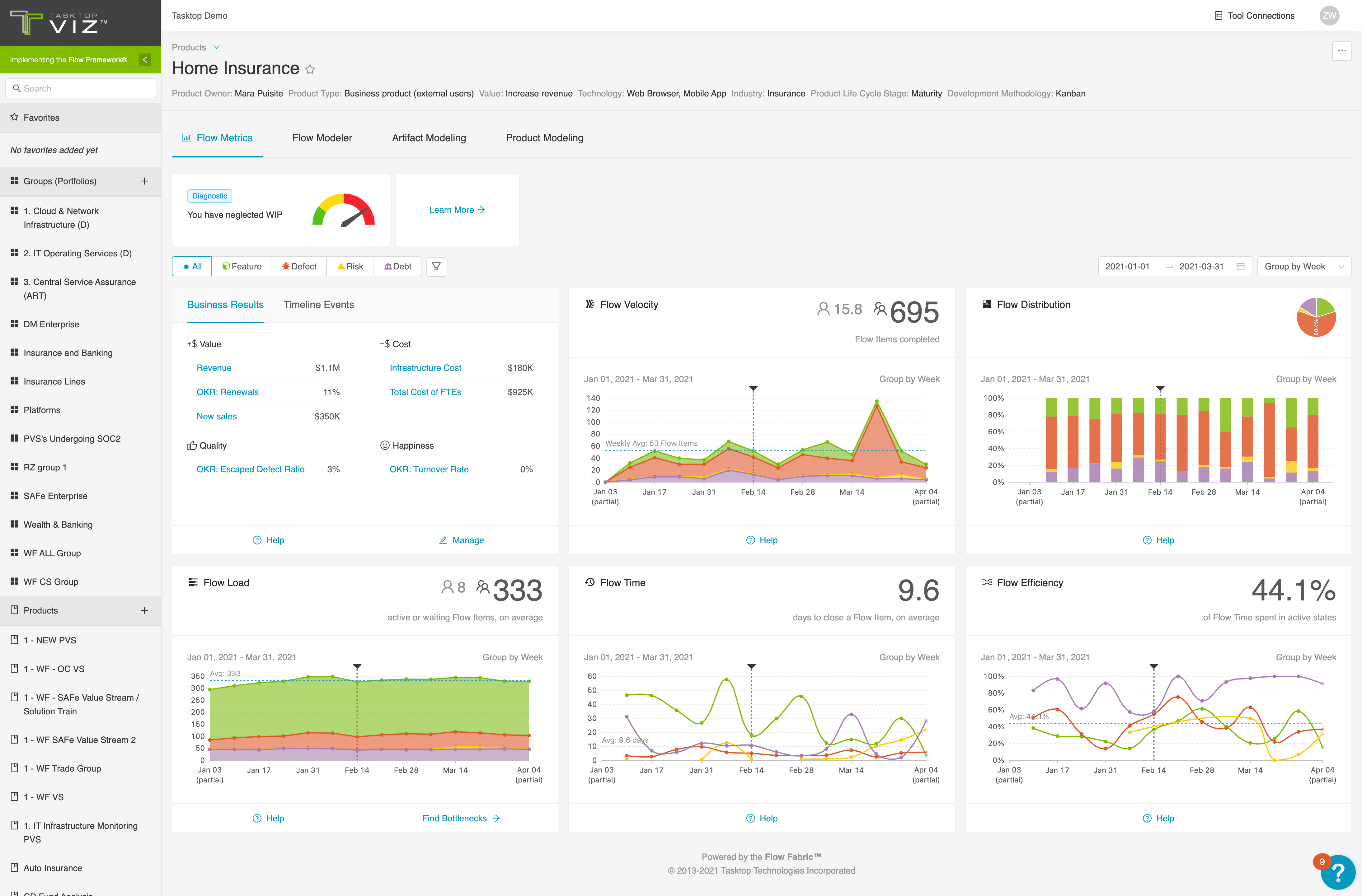
Tasktop Viz gives real-time visibility into the health of product value streams, and actionable insight into the obstacles impeding business value delivery.
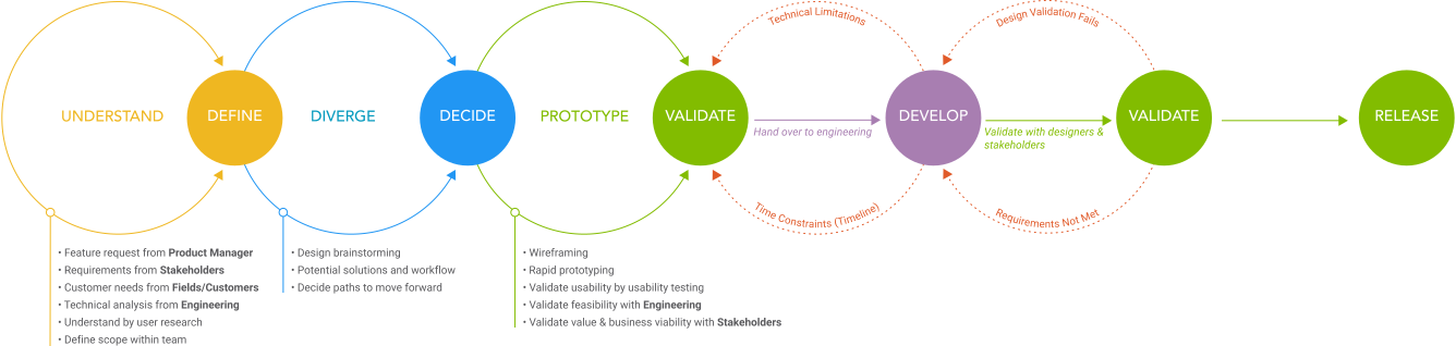
How features get designed
The general feature design process I followed at Tasktop.
Background
Tasktop began developing the first purpose-built tool to implement the Flow Framework™ — one that could automatically extract the end-to-end tool data underpinning software delivery, and translate that data into a common language that business leaders could understand.
Challenges
01
From zero with limited time
This was a totally new product with few existing competitors to learn from, and time and resources were limited.
02
Vague customer needs
We knew customers needed the tool, but we didn’t have details — and customers weren’t clear about what to expect either.
03
Difficult to test
It was difficult to find prospective users with the domain-specific knowledge to understand the concepts.
On top of that, there were a lot of unknowns: technical difficulties and what data was available remained unknown, and there was no clear roadmap.
Features and early experiments
Before starting, we ran a discovery workshop with stakeholders — including the CEO, VP of Product, and product managers — to create alignment on overall goals, scope, and milestones, and to gather user needs. Out of that came the feature list: users should be able to connect to different tools, see the artifact types and projects once connected, intuitively understand the flow metrics, add and customize products, categorize artifact types and states into flow items and flow states, change configuration at any time and see the results, see all five flow metrics, and analyze those metrics to get insights.
Early data analysis and experiment
The new product is very data-centric. To generate and visualize metrics, we first needed to validate what data we could get and, from that, what visualizations would make sense to users. We worked as a team with an agency that had expertise in both design and data visualization, over three months. During the collaboration, I touched base with them almost every week to keep track of the process and make sure the visualizations met the requirements. We analyzed the data and brainstormed a range of ideas together — from the Sankey diagram to a creative solar-system visualization. To demo the results we found examples and also implemented the idea in React using sample data; the playback turned out well, and the stakeholders were excited to see it.
Sankey flow
Flow volume between value-stream stages, shown as width.
Orbital ("solar system")
Artifacts orbiting a central value stream, by distance.
Force-directed network
Nodes positioned by connection, not hierarchy.
Narrowing the scope
After the early investigations, experiments, and meetings with engineers and stakeholders, we decided to narrow the scope to the minimum set of features. Moving forward, we advanced the product using three guiding principles.
01
Quick time to value
Give value instantly if we can.
02
Baby steps
Give a little, get a lot; give a little more, get a lot more.
03
Make abstractions easy
Modeling must occur at various layers.
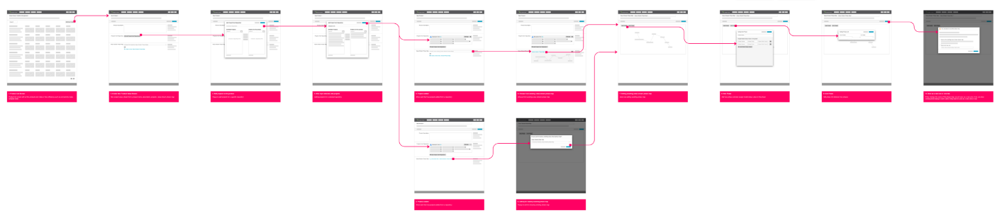
We simplified the initial workflow into a clearer sequence: model the product value stream, add artifact types, view the dashboard, model flow states, and view flow metrics.
Feedback and iteration
As noted in the challenges, it was difficult to test with prospective users. Instead, we used feedback sessions where stakeholders, product managers, engineering, and designers could review and give insight from different perspectives.

Rapid prototyping iterations
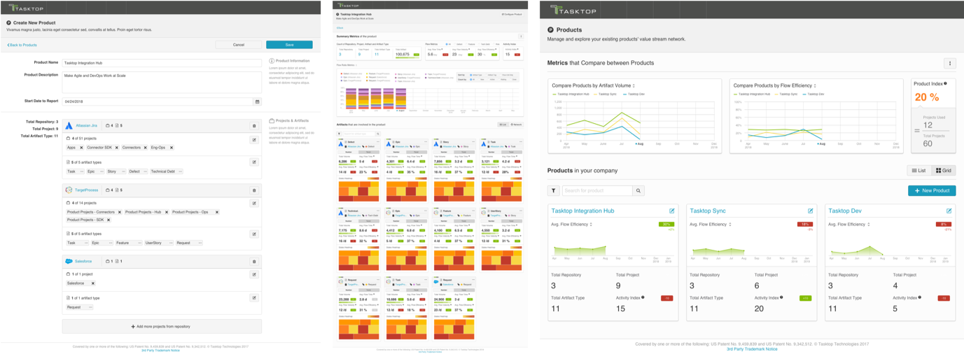
I iterated rapidly on the design. This is the first iteration:
In the second iteration I made two main changes based on feedback: instead of having all the configurations on one page, I split it into multiple steps; and I used a left navigation to make better use of the screen width and to make it easy to navigate between products (a product-centric nav).
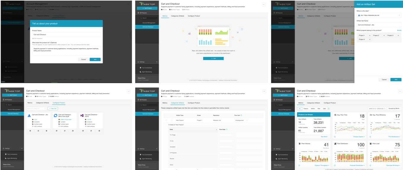
The final deliverable
The iterations converged on the version we shipped — the flow-metrics dashboard live in production.